Improving completion rates for a B2B AI learning program
Mindstone is a B2B learning platform designed to help professionals upskill in AI. Companies purchase seats for their employees, enrolling them in structured AI learning programs.
Mindstone is a B2B learning platform designed to help professionals upskill in AI. Companies purchase seats for their employees, enrolling them in structured AI learning programs. These programs blend theory, practical exercises, and assessments to help users build AI proficiency.
However, program completion rates were lower than expected. Users struggled to understand their progress, when they were ready for assessments, and how to engage effectively with the platform.
Problem signals
The drop-off was coming from unclear next steps
- Low program completion rates: Users dropped off before finishing due to confusion and friction points.
- Unclear progress indicators: Users couldn’t easily gauge where they stood in the learning process.
- Skipped personalisation: Personalisation was seen as optional rather than valuable.
- Survey avoidance impacting business goals: Pre- and post-program surveys were ignored due to poor integration into the experience.
- Assessment uncertainty: Lack of clarity on when and how to take final assessments.
Research
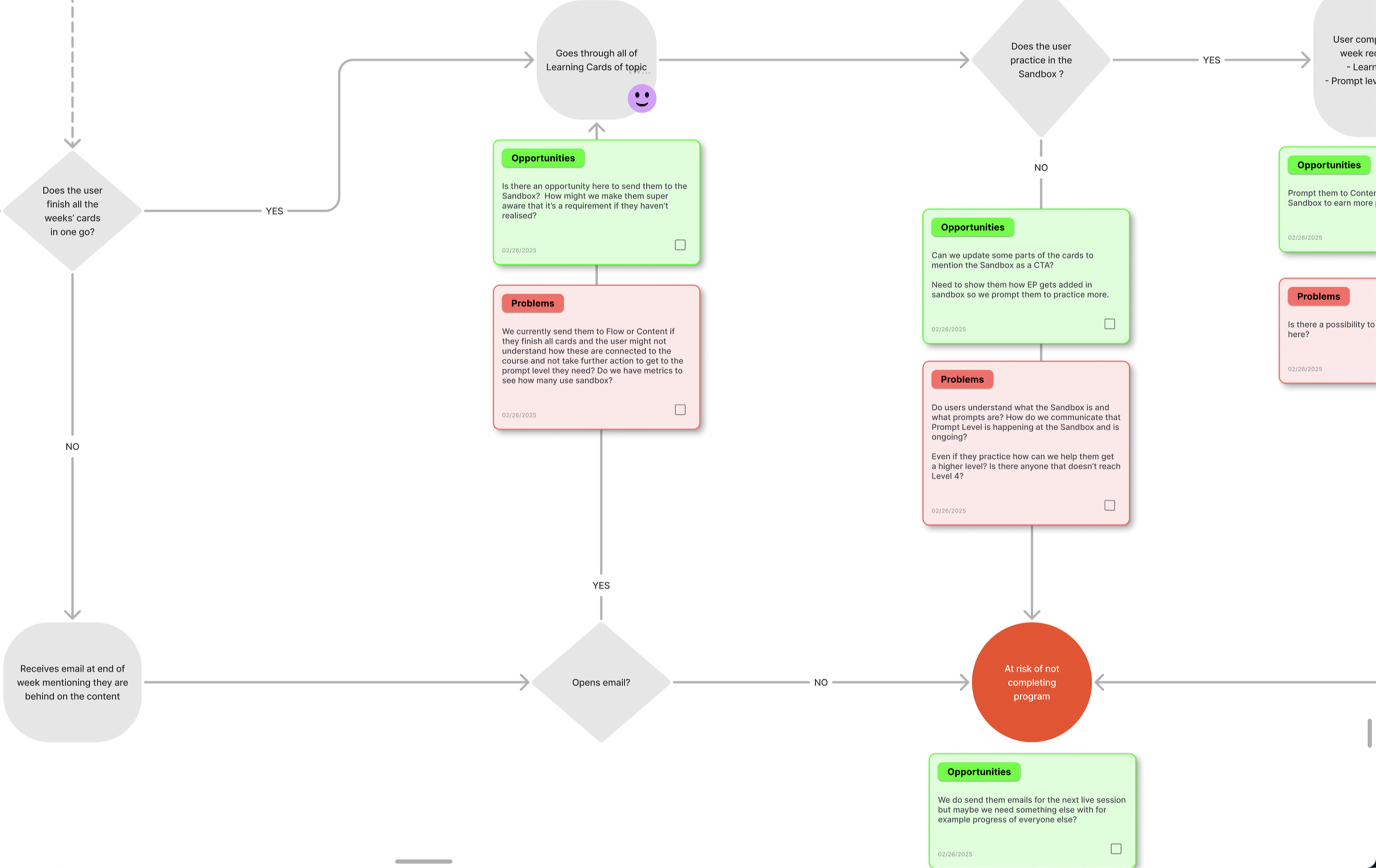
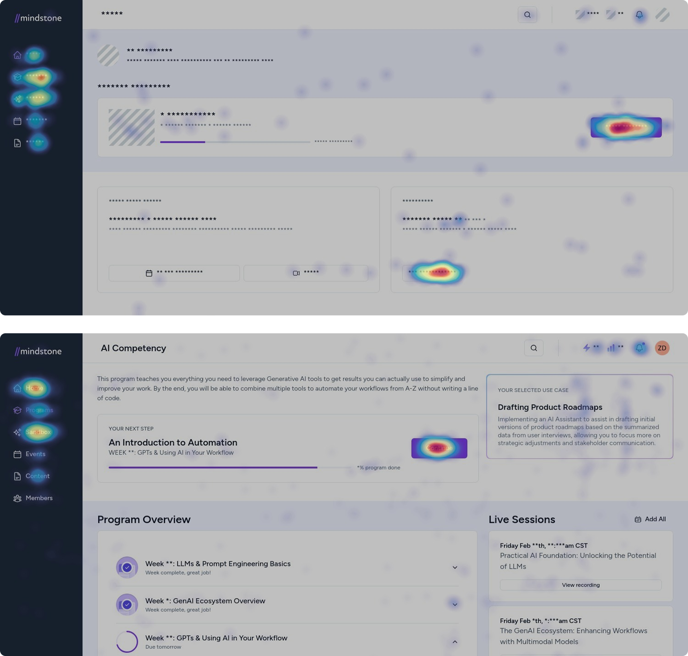
I mapped where users hesitated before they dropped off
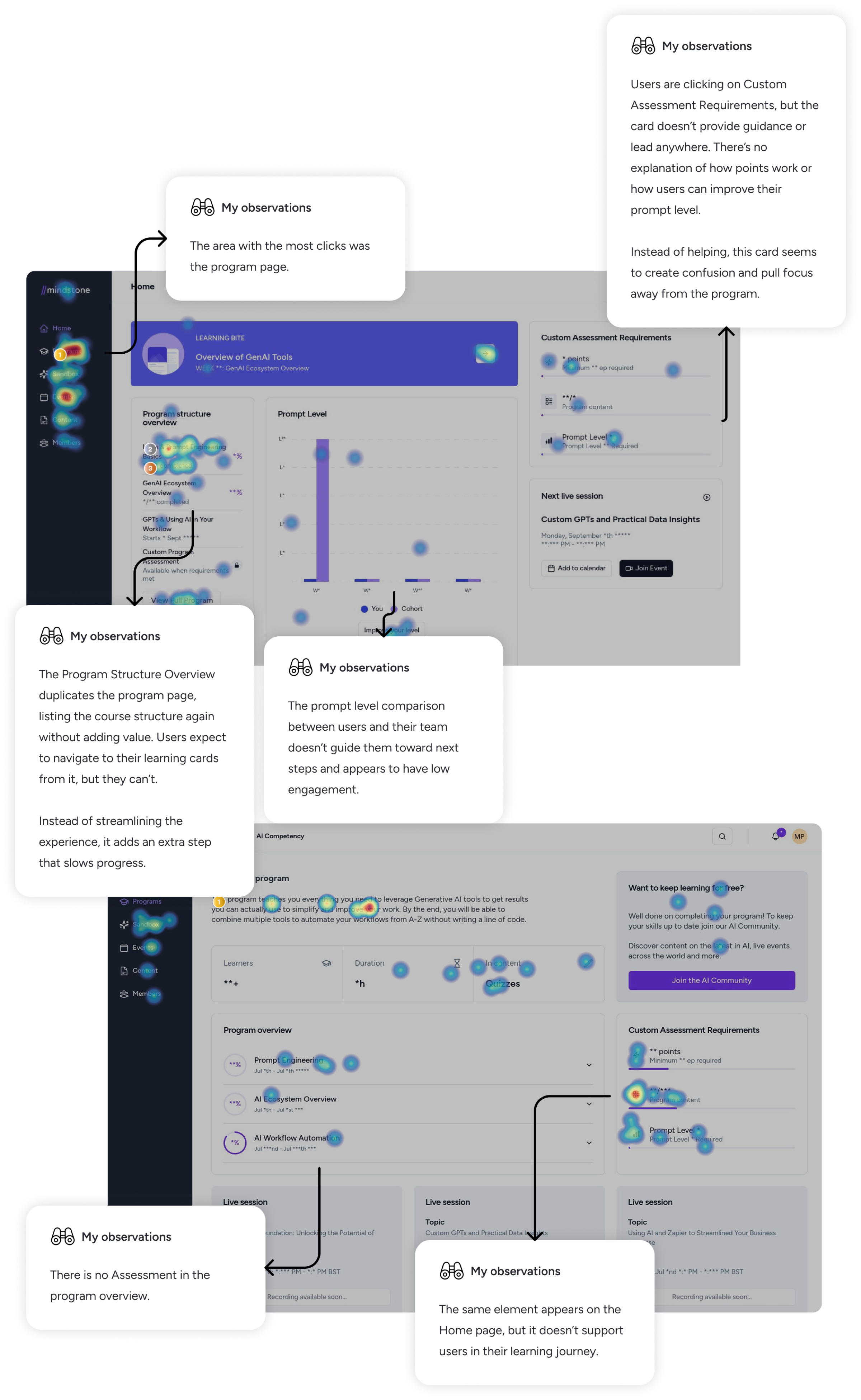
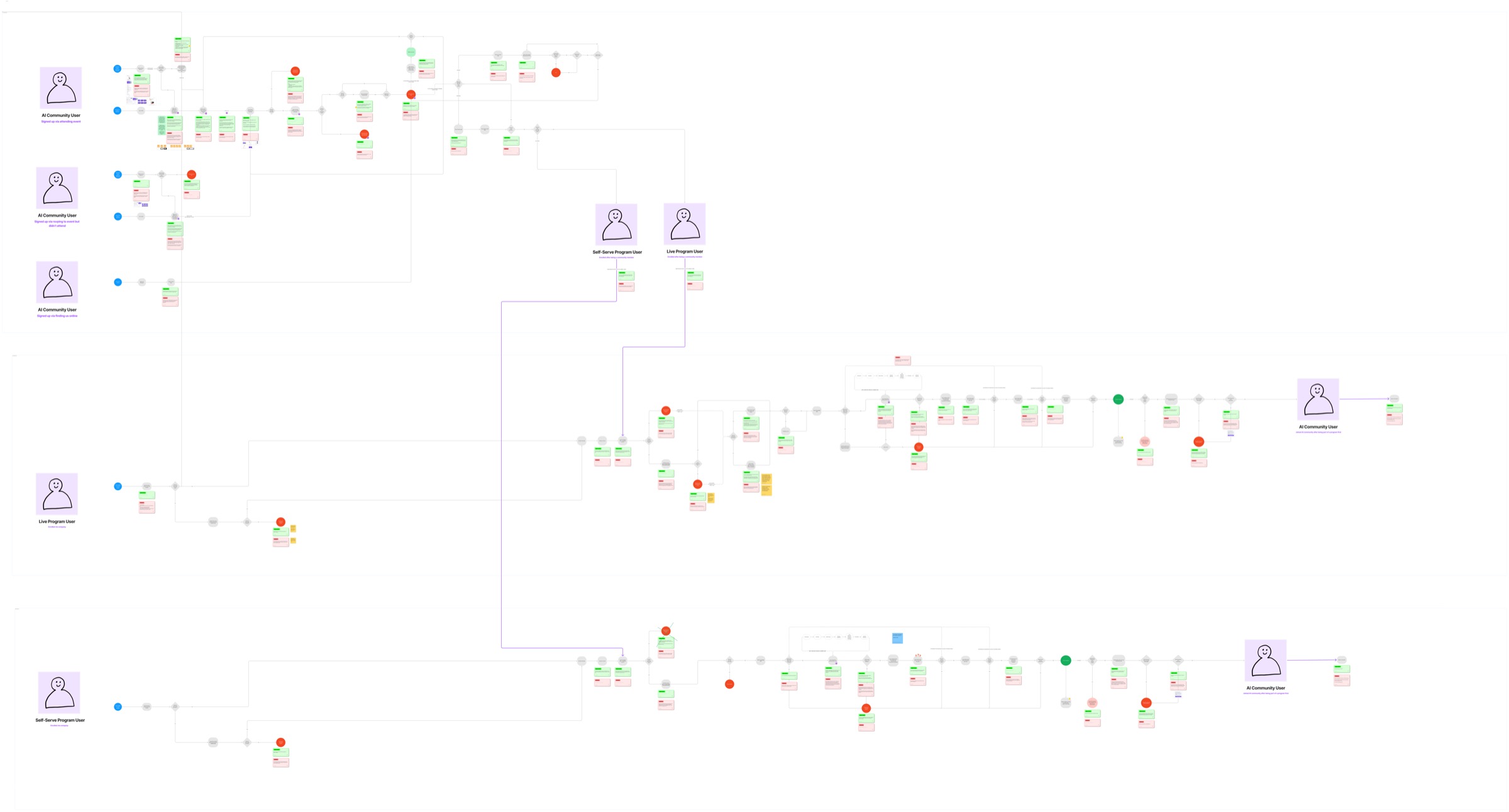
To identify key friction points, I gathered user feedback from Intercom logs, analysed heatmaps and Hotjar recordings to track hesitation areas, and reviewed engagement metrics in Mixpanel to quantify drop-offs. The findings revealed:
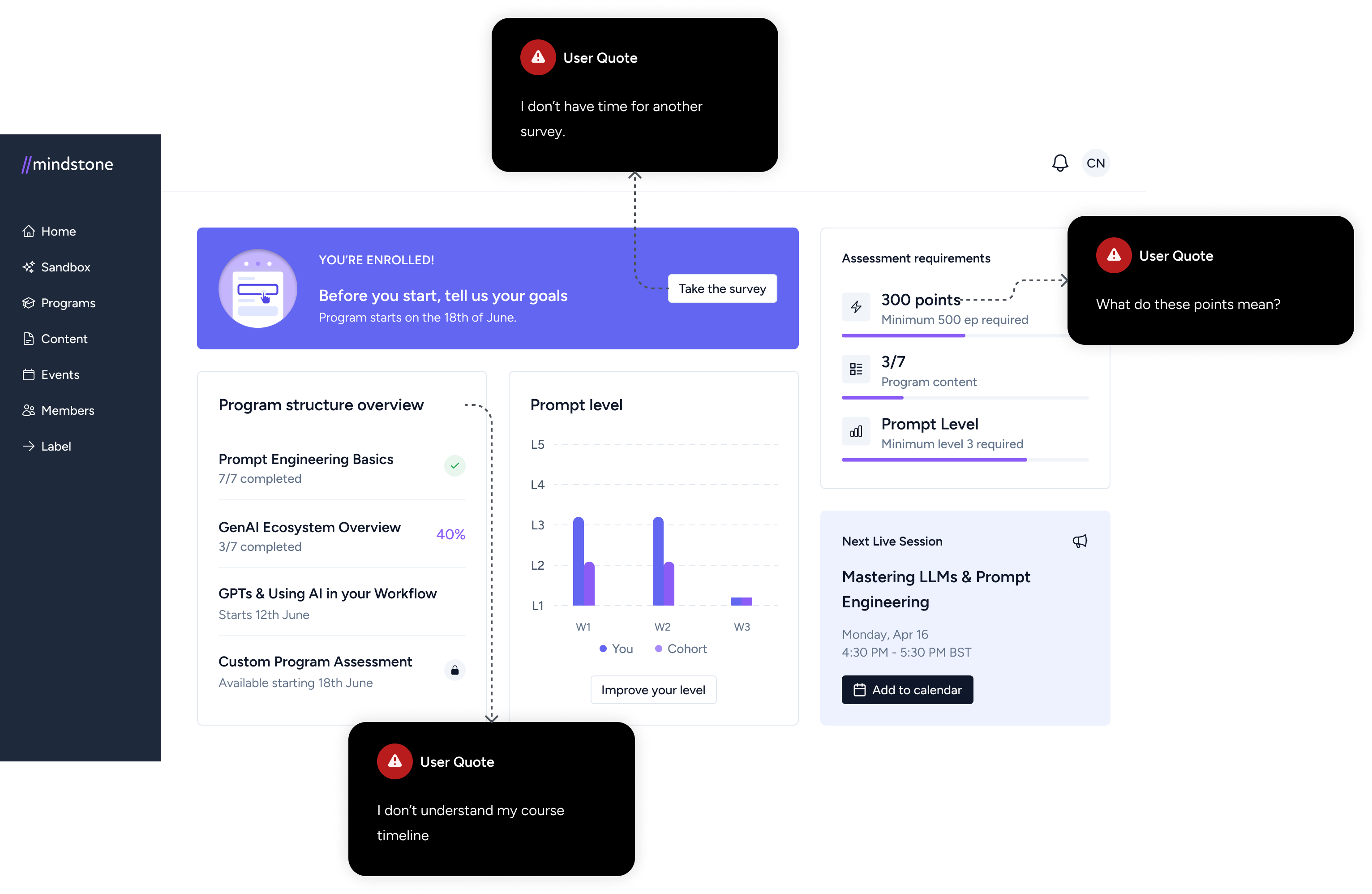
- Users were overwhelmed by too many elements on the homepage and program page.
- Points lacked meaning, leading some users to focus on gaming the system rather than learning.
- Personalization was skipped due to unclear context on when and why to complete it.
- Surveys were seen as formal interruptions, causing high drop-off rates and incomplete business data.
- The assessment step felt disconnected from the journey, leaving users unsure of when they were ready.
Collaboration
I led the redesign through scoping, alignment, and handover
Once I identified the key friction points, I led structured scoping sessions to align the redesign with business goals and technical constraints:
- Leading scoping with engineering: Defined what was technically feasible while ensuring the redesign served user needs first. We navigated backend constraints to maintain the logic required for unlocking content and assessments, ensuring they complemented the platform’s live sessions.
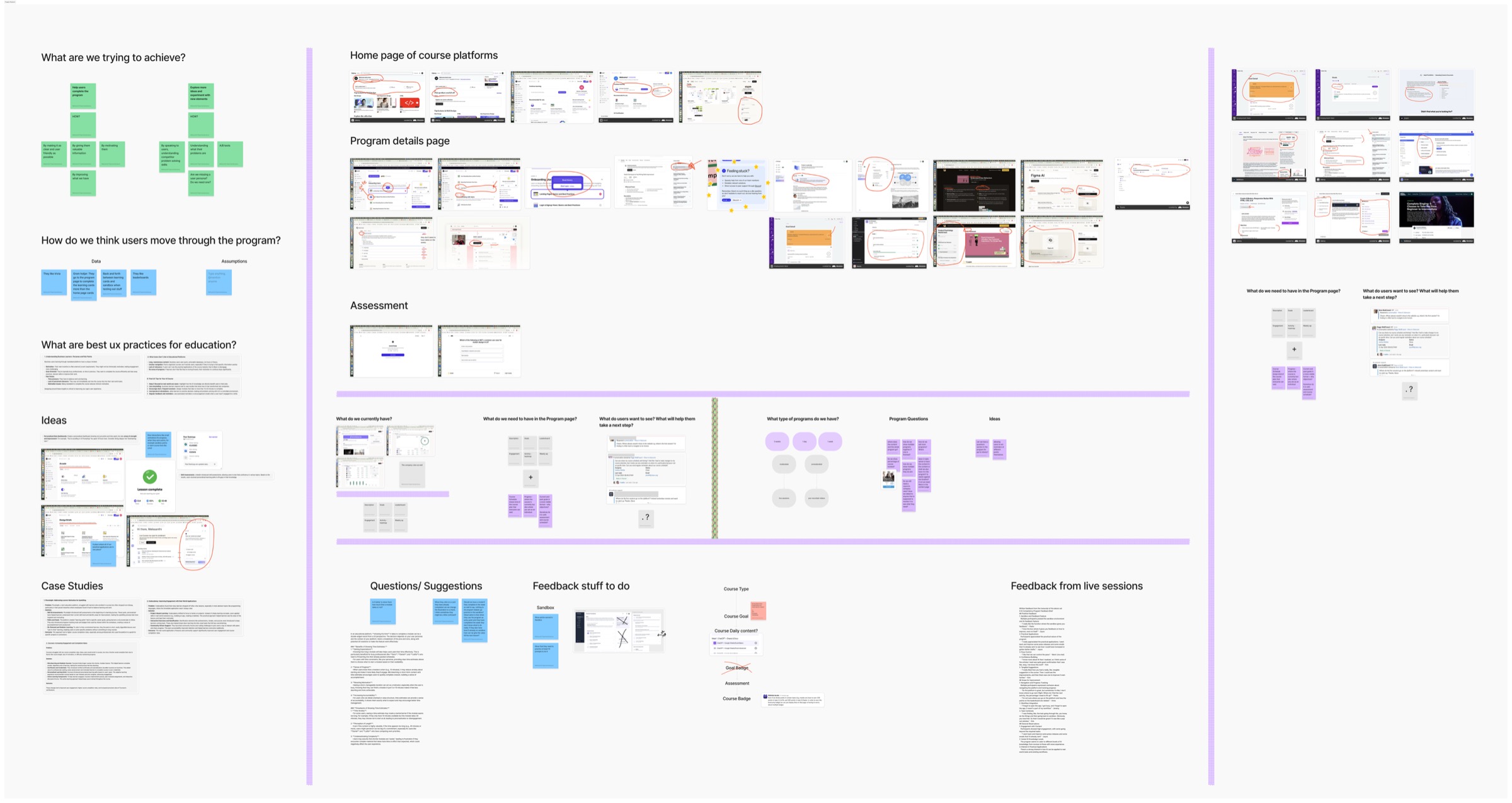
- Researching UX best practices: Studied other learning platforms to identify effective engagement strategies.
- Iterative wireframing: Created multiple rounds of design iterations, ensuring clarity and usability.
- Continuous alignment with engineering: Kept the team informed while making sure UX decisions were user-first.
- Handover & documentation: Delivered structured documentation and video walkthroughs to facilitate implementation.
Redesign strategy
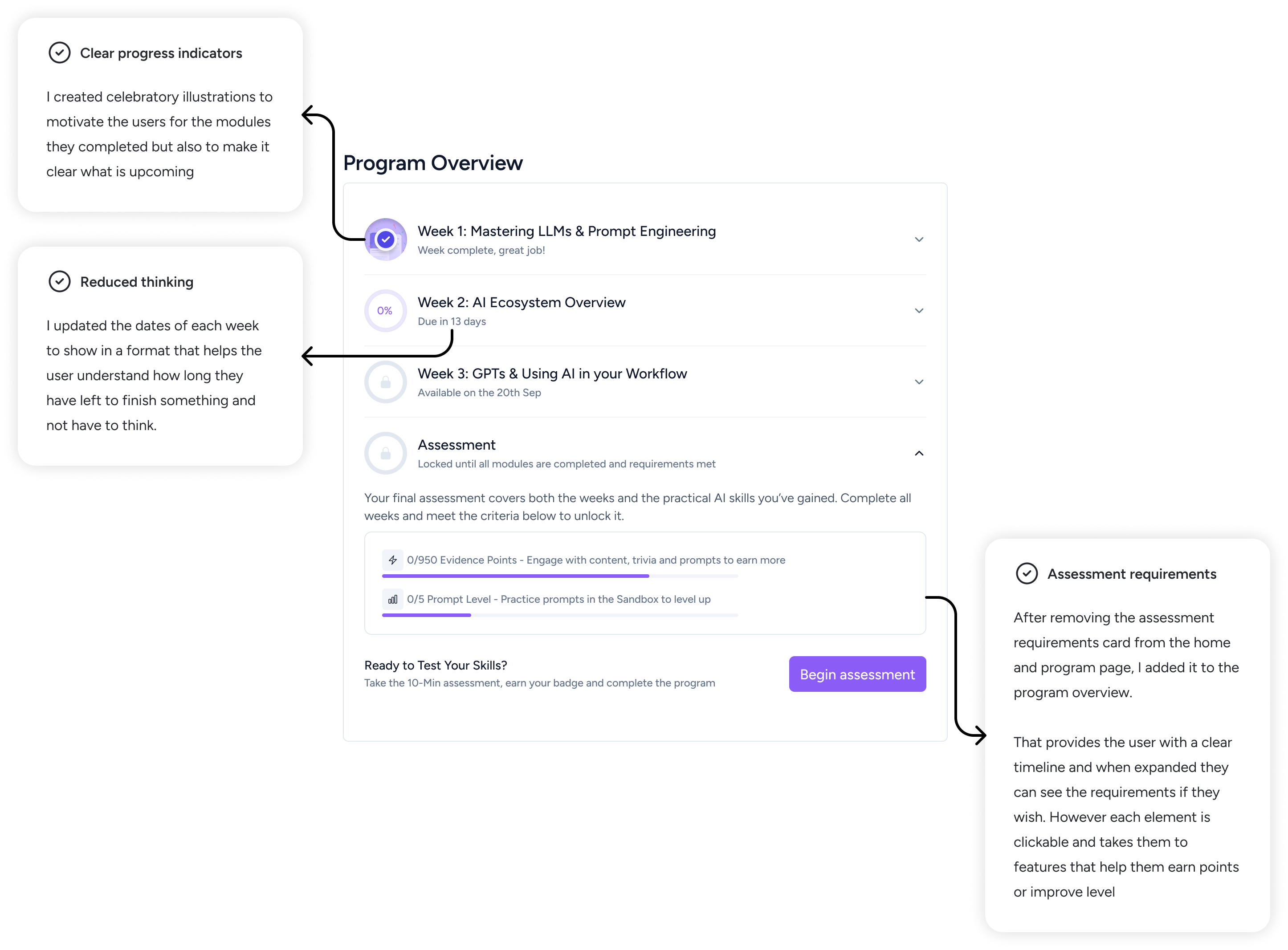
I simplified the experience without flattening the learning
My core UX strategy was to keep users focused on learning, not on figuring out the platform.
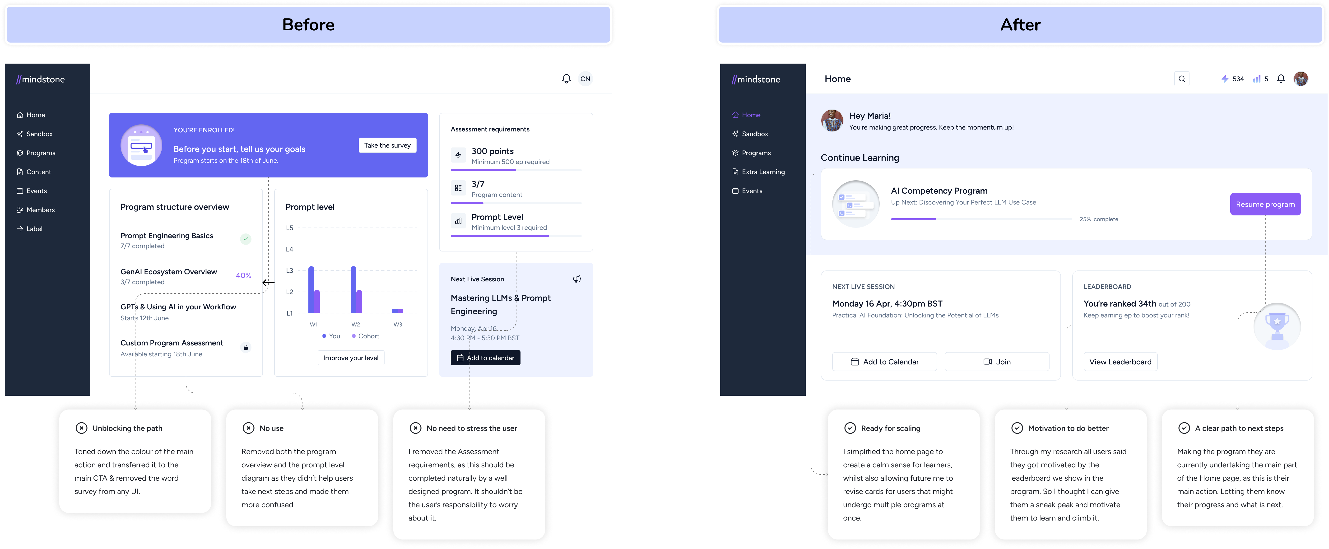
- Decluttered homepage: Removed distractions, ensuring the next step was always clear.
- Clear, purposeful, and simple copy: Ensured all instructional text and CTAs were gentle and purposeful, guiding users without overwhelming them.
- Integrated personalisation seamlessly: Made personalisation a core part of the experience instead of an optional step.
- Surveys embedded in the flow: Instead of feeling like an extra task, surveys were now woven naturally into the learning experience.
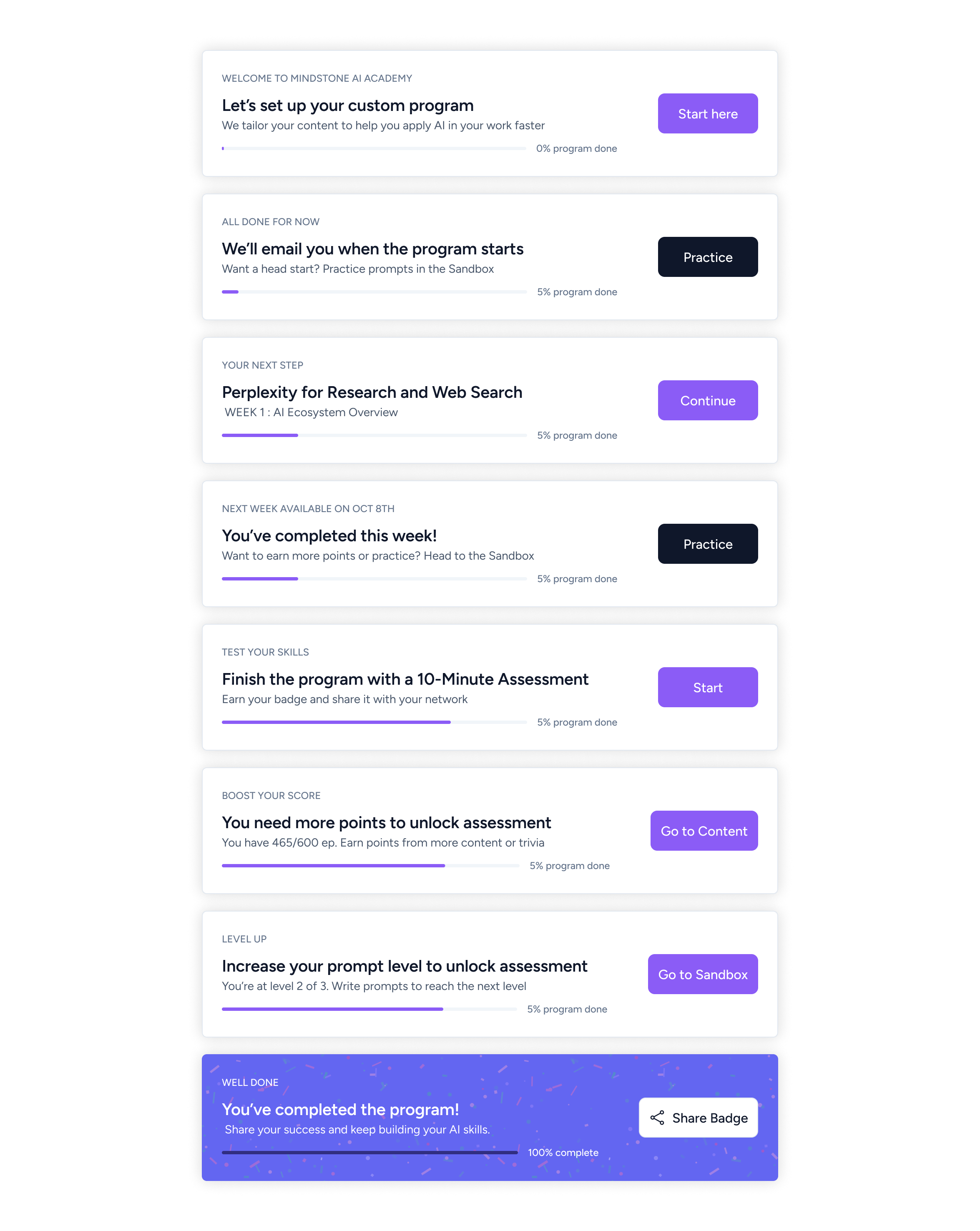
- Assessment clarity & reminders: Clearly signposted when users were ready for assessments, reducing uncertainty.
Product changes
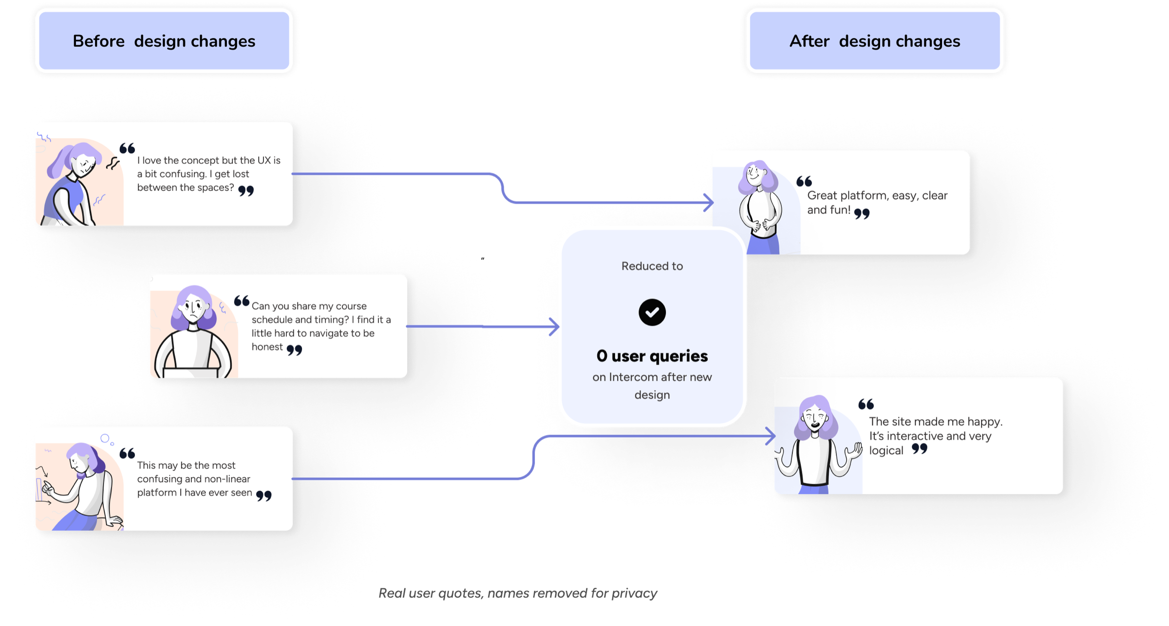
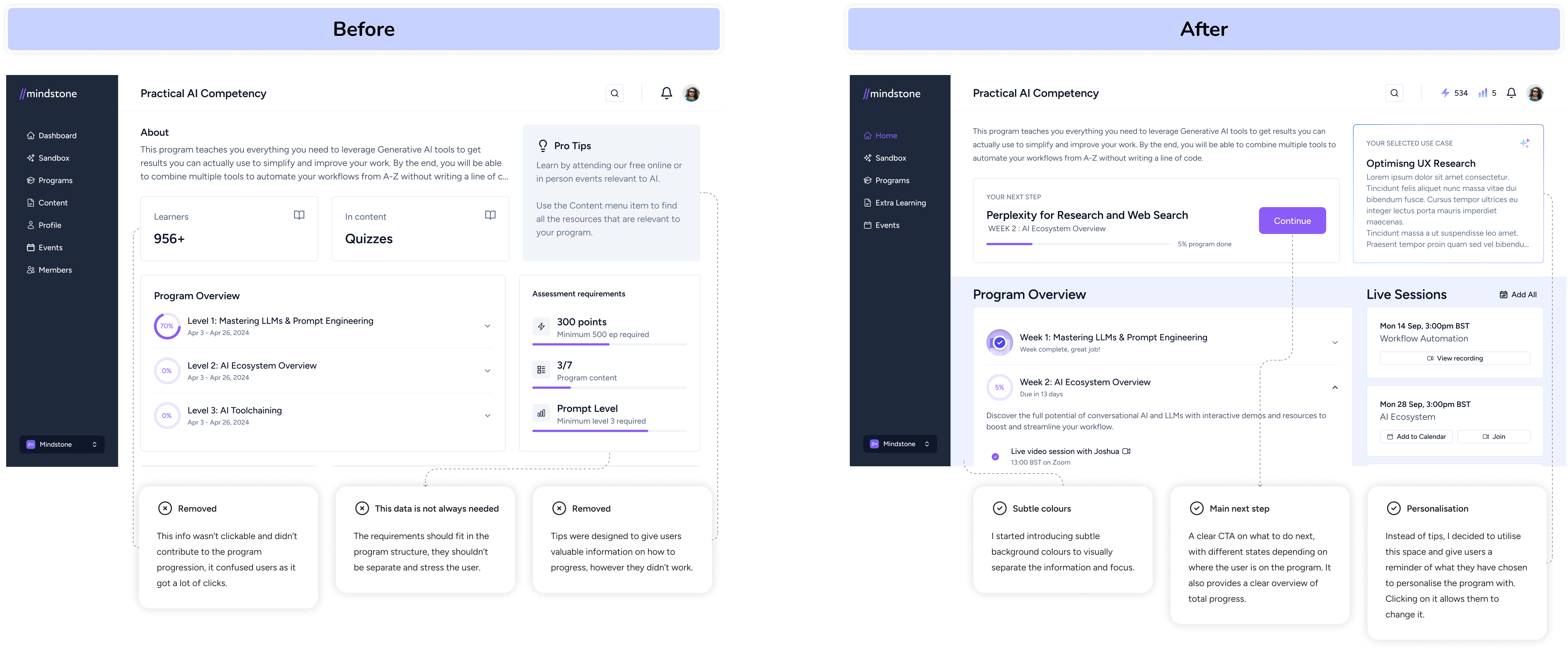
The before and after made the product direction visible
To visually demonstrate the impact of the redesign, I have included a before and after comparison of the homepage and course flow. This shows how the design was streamlined to guide users more intuitively through their learning journey.
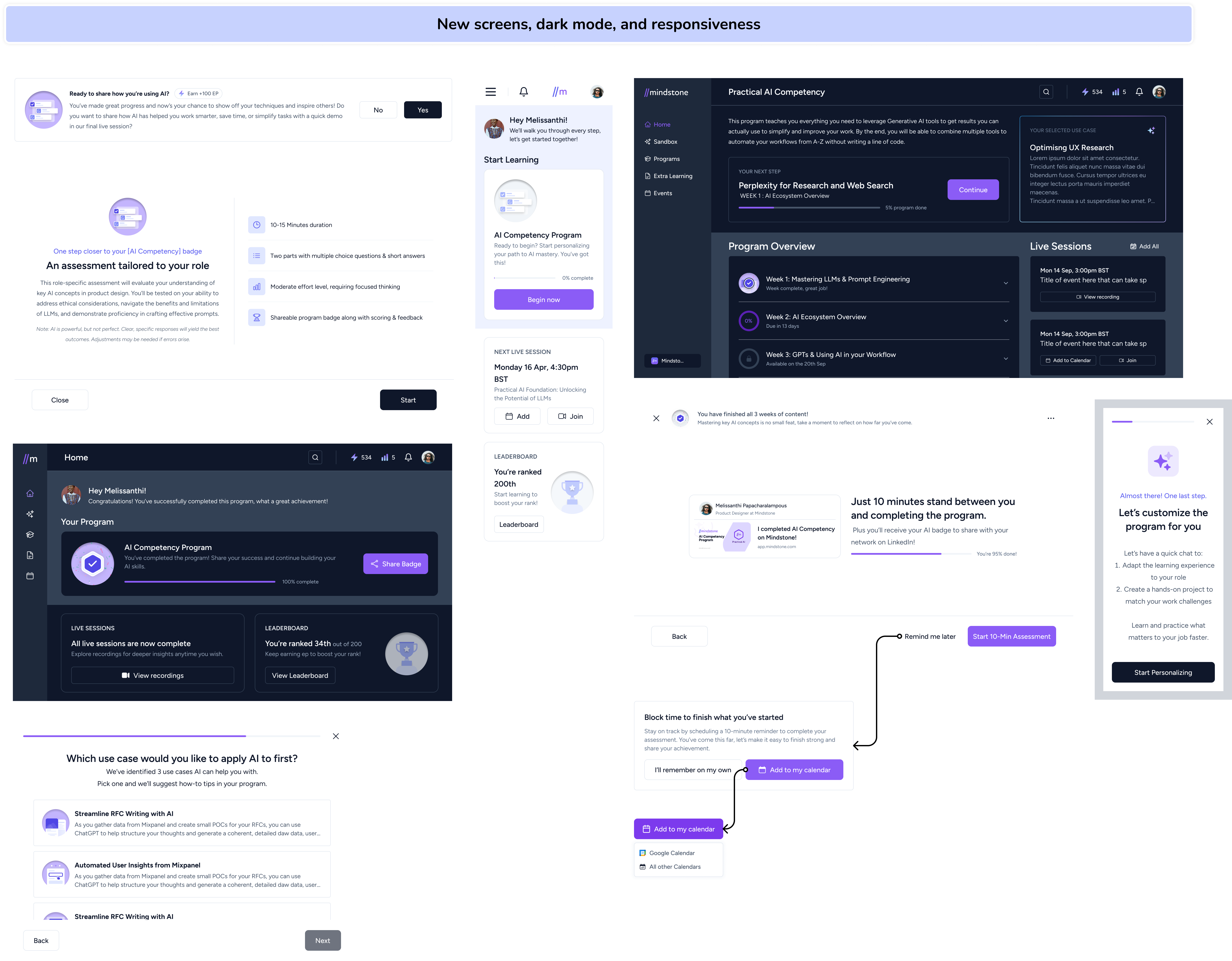
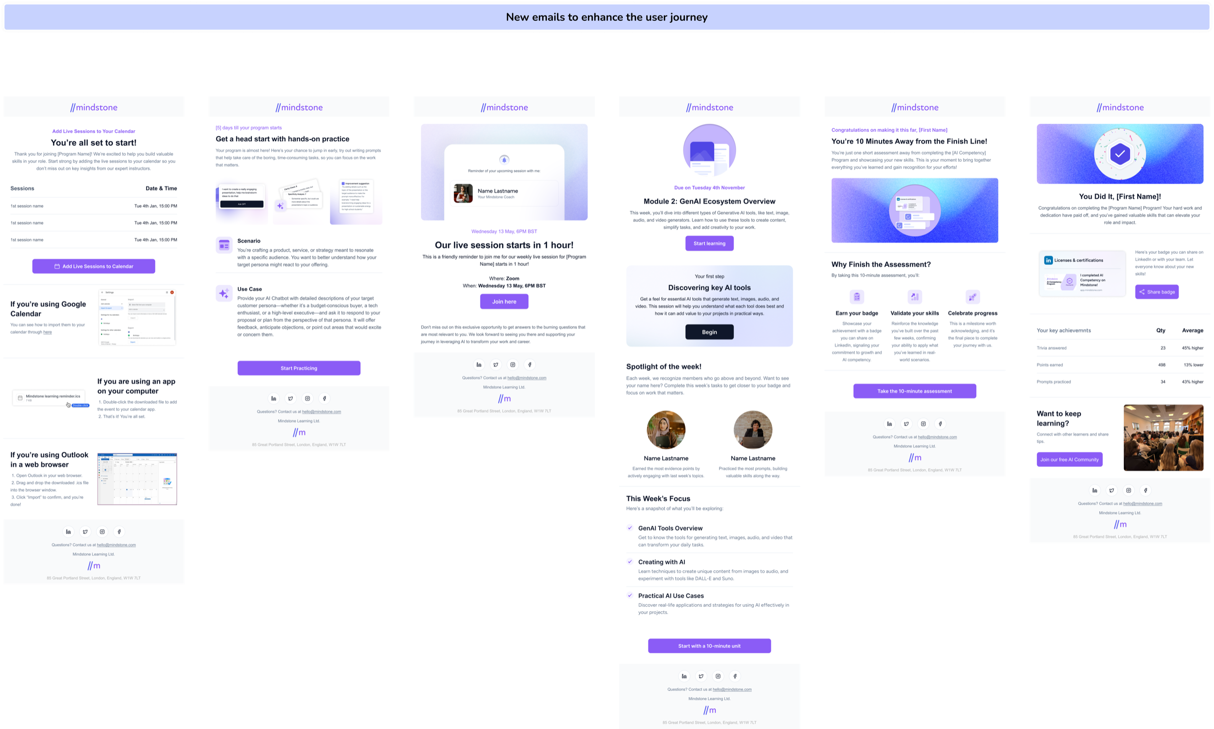
Experience system
The redesign had to work across UI, emails, and microcopy
I refined every touchpoint across the user journey, optimising responsiveness, dark mode, refining microcopy, and shaping new UI screens. From emails to in-app flows, every detail was considered to create a seamless, intuitive experience.
Behaviour
Post-redesign behaviour showed users finding the intended path
Users are clicking on the intended CTAs, seamlessly moving to their next learning topic or engaging with the leaderboard for motivation. They’re following the designed learning path as expected.
Impact
Completion, survey participation, and NPS moved in the right direction
- No more user confusion: Intercom logs show no new complaints post-redesign.
- Higher NPS scores: Users consistently praise the platform’s clarity.
- Personalisation completion: All users engaging with the program now have to personalise as part of their journey.
- Program completion rate improved: It increased by 21 percent, which meant more learners reached the end with fewer manual nudges.
- Surveys completion rate: Increased from low participation to 100 percent after embedding into learning activities.
0 0 NPS
NPS rose after the redesign.
Pre-post survey
0%
Embedded into the flow.
0% completion uplift
Program completion rose, so fewer manual nudges were needed.
Personalisation
0%
All progressing users personalised.