Rebel: from zero to a selling AI-native desktop app
Rebel is Mindstone's platform for making AI effective at work. It gives AI the context, tool access, and encoded processes it needs to act as part of the team, not beside it. I helped take it from zero to a selling subscription product in about two months, embedded in engineering: designing and shipping frontend, backend, research, and product systems alongside the team. This case covers the work that made Rebel usable: onboarding, a clearer homepage, a real action model, and the research and automation layer that kept the product learning after launch.
The frame
Why the hardest problem on Rebel was not adding features. It was making a new kind of product understandable enough for people to trust and use.
I had been designing Mindstone’s learning platform, and it was working. Engagement was healthy, retention was holding, the data was rich. Underneath the numbers was a signal we had not built for: people did not want more lessons. They wanted action.
Rebel was the bet we made on that signal. In about two months, it moved from zero to a working AI-native desktop app that clients could buy through subscriptions. I joined as a product designer embedded in engineering, shipping frontend and backend in Cursor alongside the team. Two months in, Rebel could search across tools, run real tasks, and ask for approvals. What it could not do was explain itself.
The recruiter-version summary is simple: I helped turn an ambitious AI desktop app into something people could understand, trust, and act on. I did that in research, product structure, and code. The work ranged from onboarding and homepage clarity to the action model, automation behaviour, and the shareable notes and artefacts Rebel produced once it started working inside real teams.
This case study covers the four moves that made Rebel usable: onboarding, a clearer homepage, a real action model, and a tighter loop between research, automations, and the shareable artefacts the product generated.
Original onboarding
3 / 10
Users completed the four-step setup.
After the rebuild
+37%
Relative lift after simpler framing.
Actions adoption
+69%
After the Inbox → Actions rebuild.
Homepage activity
+83%
Messages submitted, post-redesign.
Design challenge
Rebel had to teach a new mental model
Most software teaches people where to click. Rebel had to teach people how to work with an AI system that could take initiative.
Rebel is not a chat window. It is a small constellation of concurrent behaviours: spotting patterns, triaging the day, prioritising the urgent, asking when a decision matters. All running at once, on your behalf. The mental model the product had to teach, in one surface.
Where trust broke
The four-step onboarding was losing seven of every ten users. The funnel was not the problem. The language was.
In the comprehension study I ran, people could tell what button to press, but not why. The failure was not the drop-off curve. It was the language.
The original setup asked people to connect technically unfamiliar things before the product had earned the ask. Phrases that were supposed to feel enabling produced the opposite.
Original onboarding · Jan 2026
3 in 10
Only three of ten users who started setup reached the end of the four-step flow. Several active users had skipped it entirely.
Source: PostHog
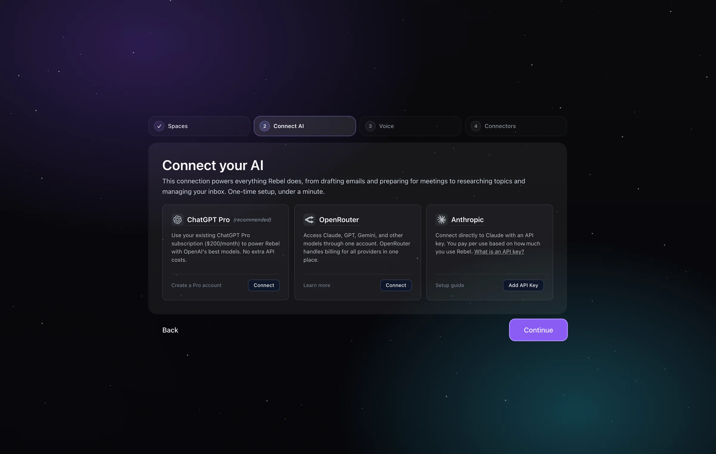
So I stopped treating onboarding as a setup checklist and started treating it as an explanation problem. I cut the jargon, named what Rebel could do once each connection existed, and made step one feel like the start of useful work. Most of the technical work moved into the background. The user only had to decide the things that were theirs to decide: which model to use, and what it would cost. The interviews mattered because they gave us the exact wording people were stumbling over, not just a funnel drop-off to speculate about.
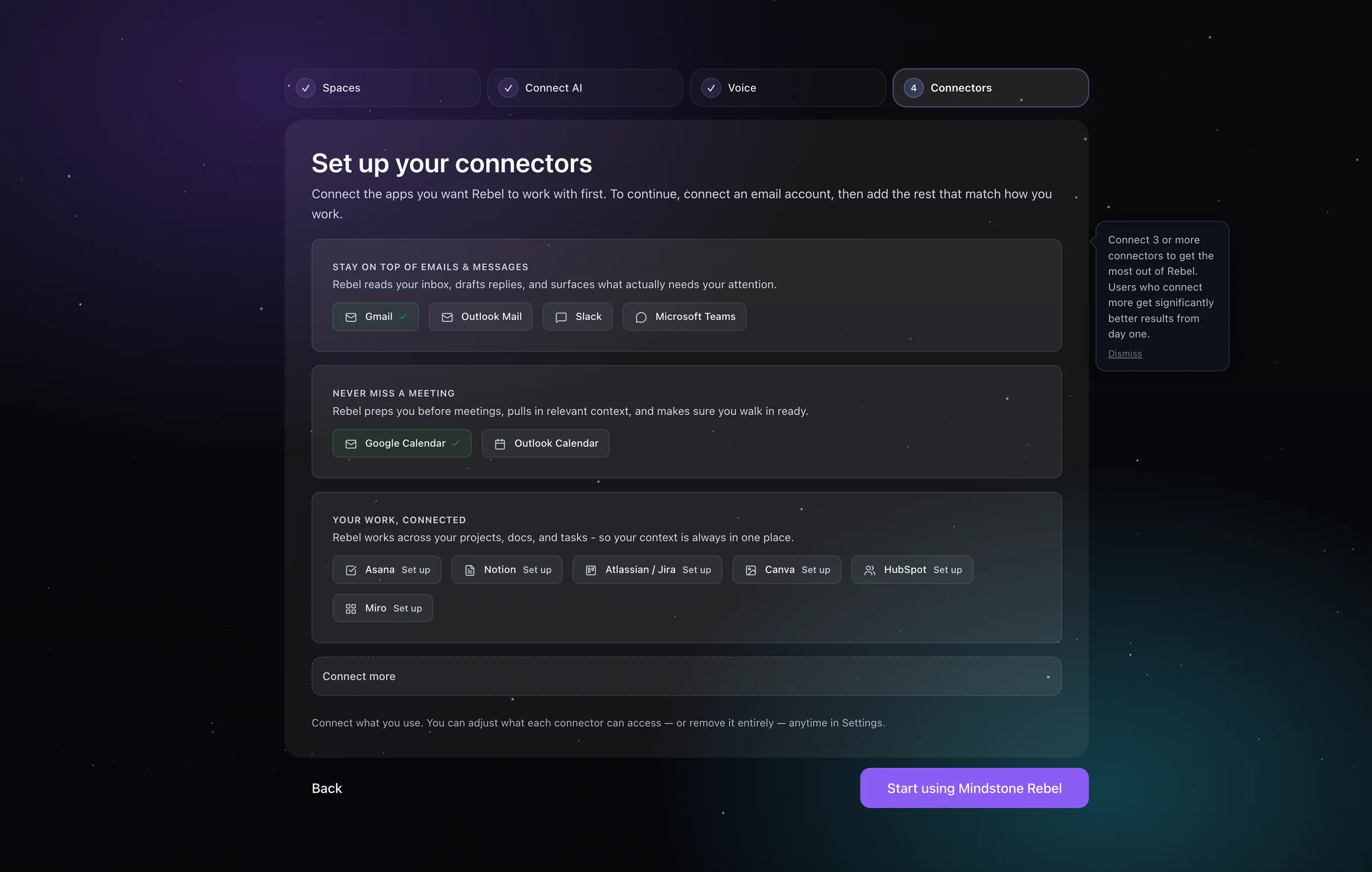
The product changes
Once setup was holding, the product itself had to be made legible.
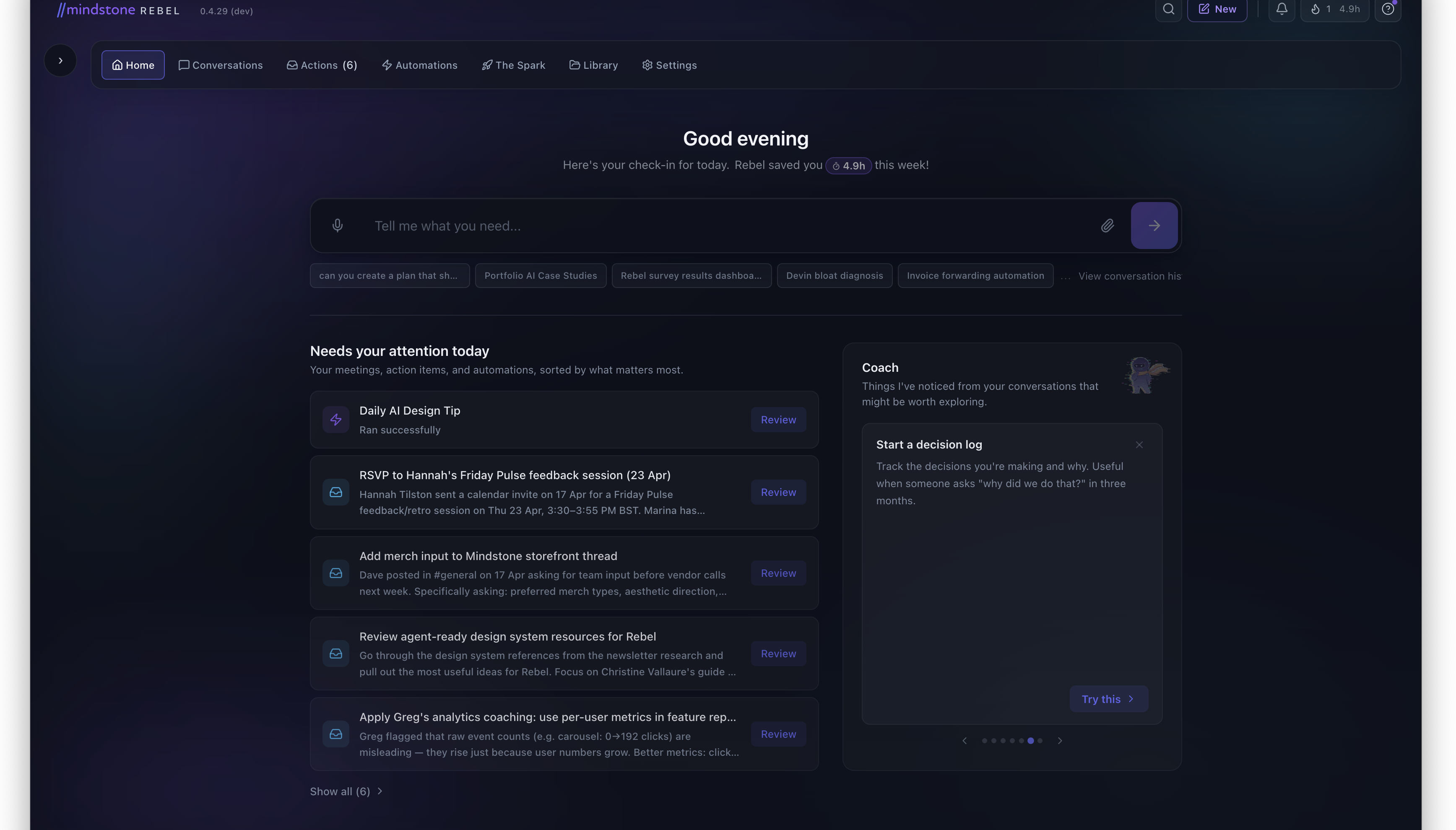
Homepage
The homepage was the second problem
Once users got through setup, Rebel was surfacing useful things but not explaining them. The homepage and what was then called Inbox were carrying too much ambiguity. I pulled out the specific cards that had to work harder.
Four details did the work on this surface:
- Time-saved as the trust signal. The greeting carries a hours-saved-this-week badge so the value of the system shows up before any task does.
- Context-aware prompts, not a blank input. Suggested prompt chips below the input pull from recent work, so the first move is one click, not one essay.
- Triage, not firehose. “Needs your attention today” stack-ranks the day so the user reads a short list, not an inbox.
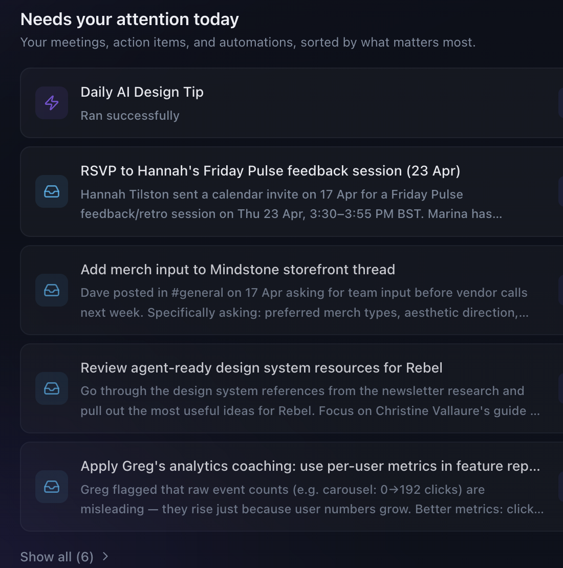
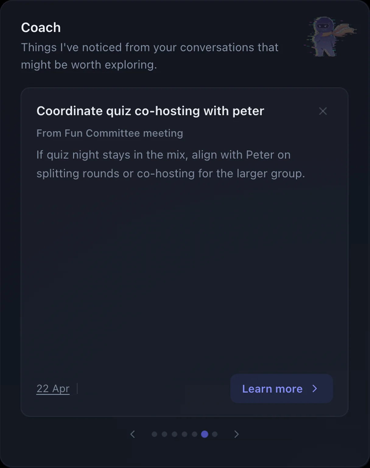
- Coach surfaces patterns proactively. The right-side widget reads recent conversations and offers one small next move at a time.
The data confirmed the homepage was becoming more active and exposed the next trust problem.
Homepage messages submitted · Feb–Mar 2026
+83%
After the homepage cleanup, people were engaging with the input and triage surface far more than before.
Source: PostHog
Inbox-card dismissals · one release window
+1,117%
Over the same window, dismissals of AI-surfaced inbox cards spiked. People were engaging more, but rejecting a lot of what Rebel surfaced.
Source: PostHog
Action model
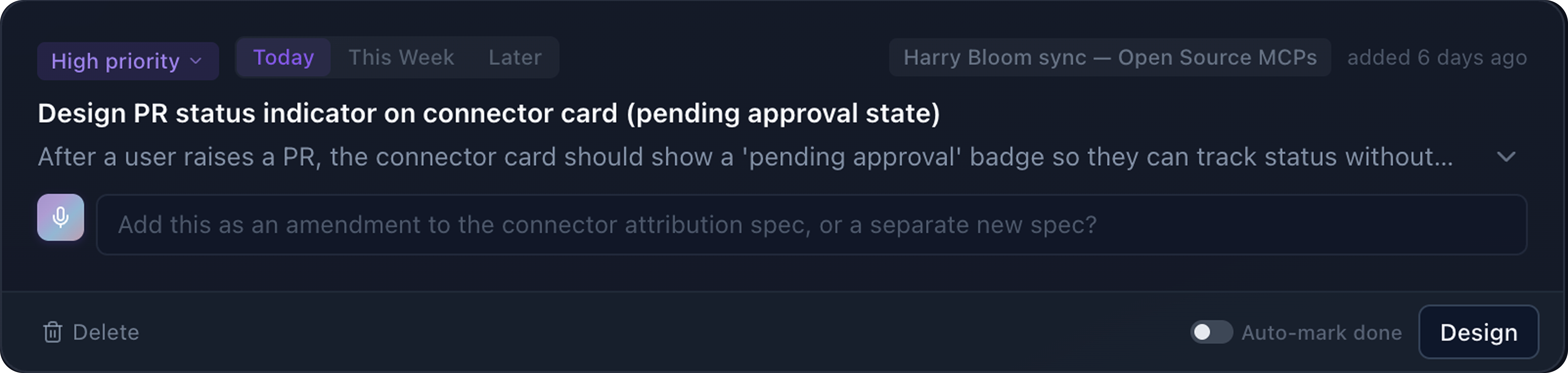
I rebuilt Inbox into Actions
This was the moment the product stopped looking like a stream of AI output and started reading like a place to make bounded decisions.
Research drove this. I ran a comparative analysis across Gmail, Things, Todoist, Linear, Notion, Superhuman, Slack, Apple Reminders, and Microsoft To Do, looking specifically at how each handled done vs archive vs dismiss vs save-for-later. Those choices carry very different weight when an AI is generating the items.
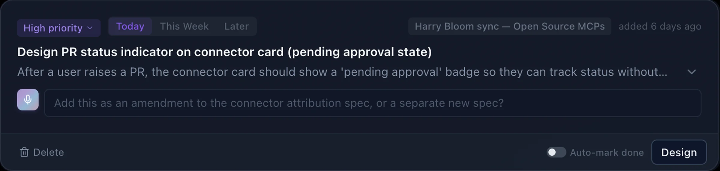
From that, I rebuilt the model around a clearer action surface: Actions instead of Inbox, Done instead of Archive, temporal tabs for Due Today / This Week / Later, and 15 context-aware CTA verbs so the button says “Design” or “Review” instead of a generic label. The homepage also got a triage layer: Act, Review, FYI.
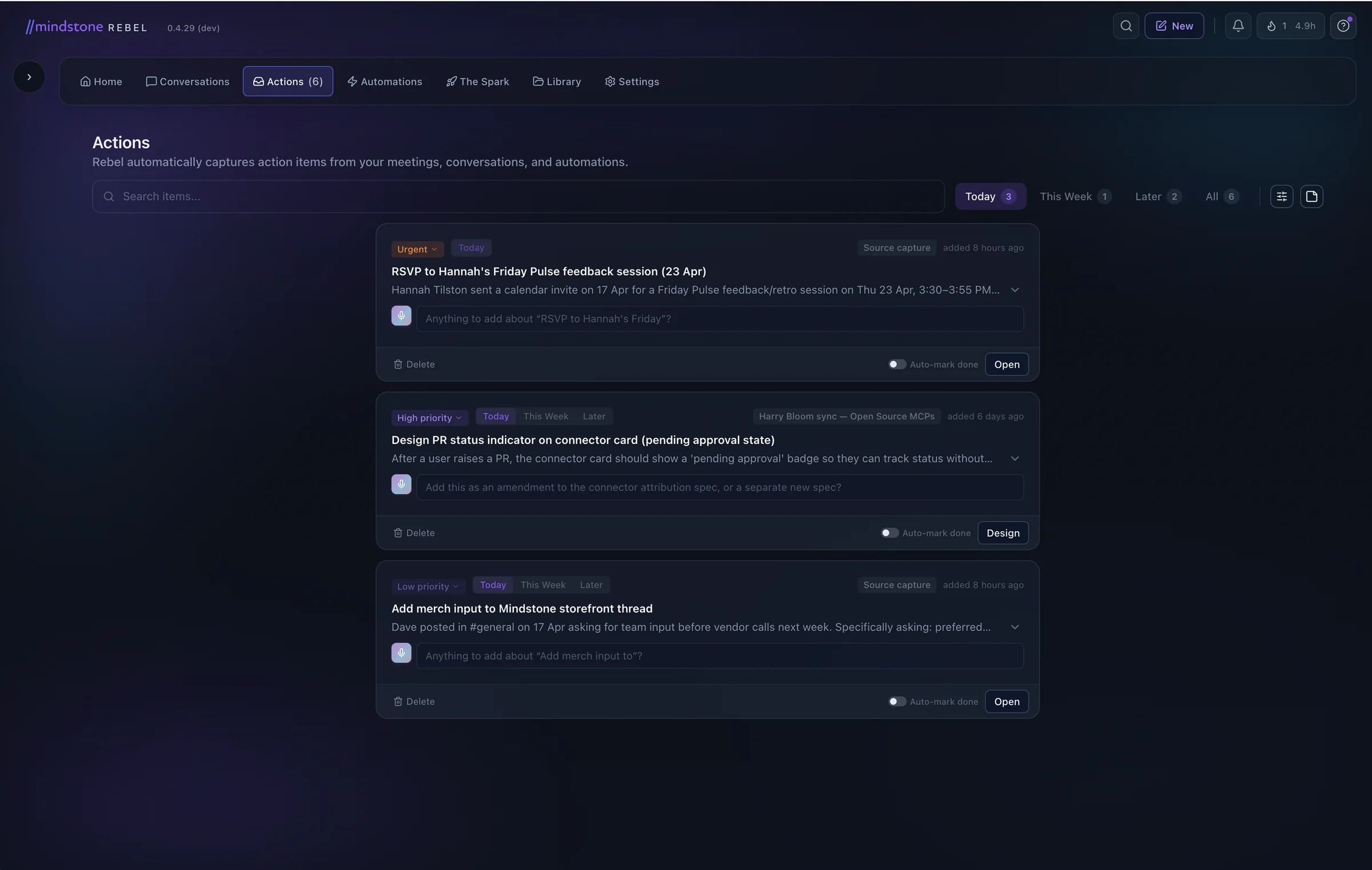
The redesign surfaced the right debate. Approvals couldn’t just live in notifications. With several agents running in parallel, that surface broke down fast. The fix wasn’t a bigger notification. It was a proper space for decisions.
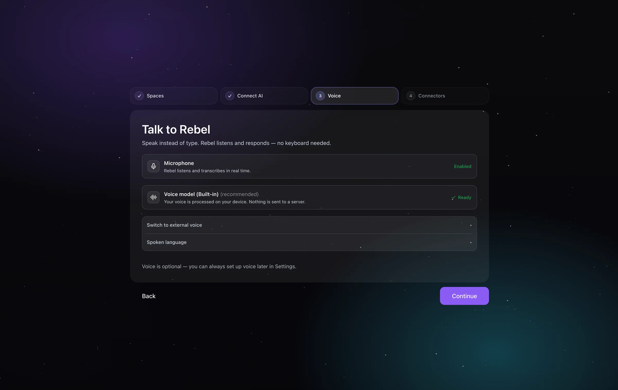
Execution transparency
The Thinking Panel had to calm, not explain
The Thinking Panel was Rebel's execution status surface. If it showed too little, people assumed Rebel had stalled. If it showed too much, the panel became noise.
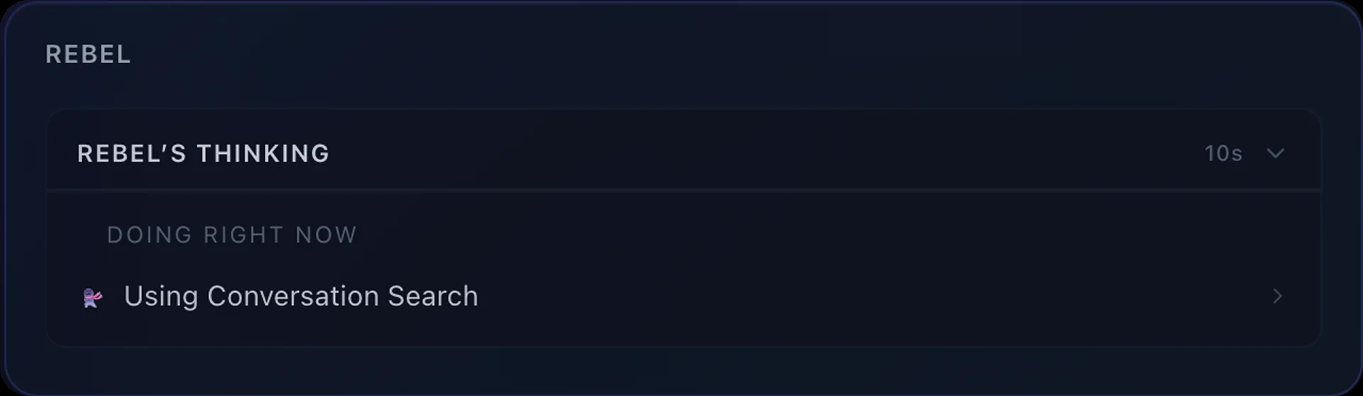
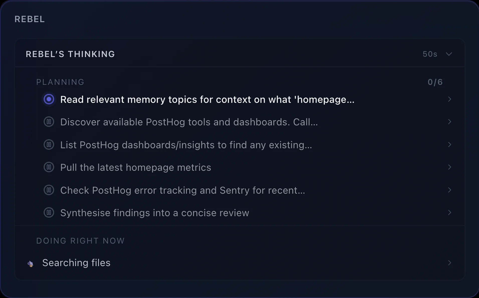
In the Thinking Panel heuristic evaluation, the baseline scored 4.25 / 10 for cognitive overload. The direction was a collapsed status bar that only opens up when the task actually needs a plan.
That principle ran through the rest of the work. Onboarding needed interpretable steps. Home cards needed interpretable relevance. Actions needed interpretable states.
By that point, the remaining product question was bigger than any one surface. If Rebel was going to be useful in real work, it had to keep expanding beyond the built-in tools. That meant making contribution part of the product story, not a side path for technical users.
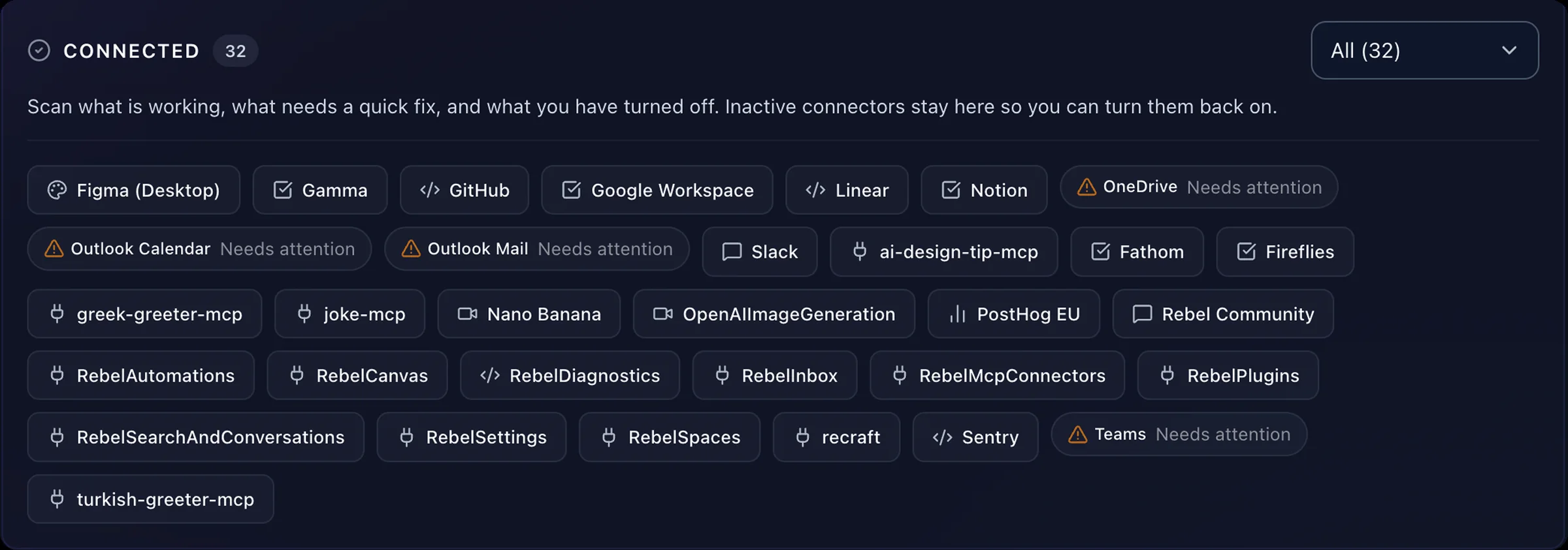
Open Source MCP
I built the way users contribute missing tools
Rebel was only as useful as the integrations it had. Users were already building custom connectors on the side, and we had nowhere for that work to land.
By this point there had been 570 Custom MCP Connected events. Users were extending Rebel on their own. The product just wasn’t acknowledging that behaviour.
I designed the in-product flow for Open Source MCP: users describe what they need, Rebel scaffolds and tests a connector locally, and they can optionally contribute it back to the community catalog without opening GitHub. The goal wasn’t to invent demand. It was to turn an improvised behaviour into a first-class flow, legible to people who are not software engineers.
Brand craft
The Rebel mascot
A small breadth piece: I designed Rebel's mascot family in a day against a team brief, iterated in Recraft.ai. One base character, five personalities.


These also drove a merch run the team has since rolled out. Product UI, research, implementation, and brand craft are not separate lanes for me. This was the breadth version of that claim.
The through-line across all of this work was the same: make a new kind of product easier to understand, then stay close enough to implementation to ship the change instead of just describing it.
How I worked
The proof behind the 'embedded in engineering' claim: a year of design, frontend, backend, and MCP work inside the Rebel codebase.
I moved between analytics, research, design, team debate, and implementation instead of staying in a separate lane. I demoed changes directly in the product, pushed for tighter alignment when the team was too asynchronous, and shipped UI and behaviour changes myself in Cursor.
To hold consistency without policing it, I wrote design rules into the repo and built design agents inside the app. Rules kept the surface cohesive. Agents narrowed the distance between a design decision and a live product change.
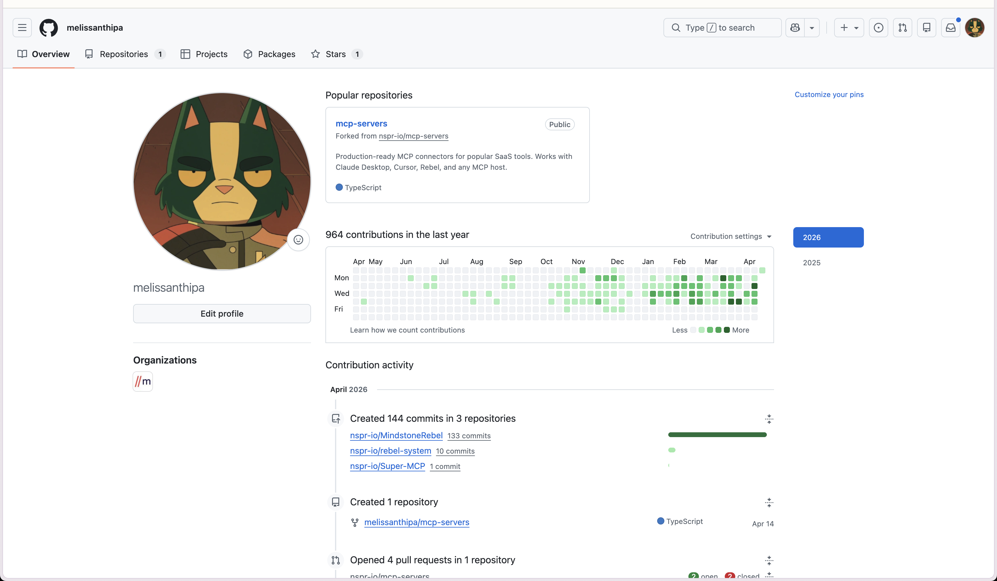
GitHub contributions
964
Design, frontend, backend, MCP. Last 12 months.
April commits
144
Across MindstoneRebel, rebel-system, Super-MCP.
Rebel repos
3
Product app, runtime system, MCP router.
That thread is what I want a hiring manager to take away. I am at my best when the product is ambiguous, the behaviour is live, and the design work needs to stay close to implementation.
What changed
Rebel started selling and sticking
The product moved from internal bet to revenue, and the work changed shape with it. People stopped asking what Rebel was for. They started using it as part of their day.
Time to revenue
2 months
Zero to a selling subscription product. Multiple paying enterprise teams.
Daily active users
70%
Of signed-up users opening Rebel on a typical day.
The hard part of AI-native design was never making the AI more impressive. It was helping people build a working mental model of the system quickly enough that they would trust themselves to use it. When that landed, the behaviour that followed was specific. People came back daily. They started telling us what they could not work without.
That is the work I want to keep doing. Make a new kind of product legible at every layer, then stay close enough to implementation to ship the change instead of just describing it.