Designing open-source contribution agents for an AI-native desktop
Rebel is Mindstone's AI desktop operating system. After we shipped the first market-ready version, the next design problem was scale: how to let users and contributors create new capability through open source, while keeping the product coherent, transparent, and grounded in good UX.
Rebel had to become something users could change
After the first market-ready version shipped, the next challenge was letting more people shape what Rebel could do without losing product judgement.
I joined Rebel while we were still building from zero. Once the product was in people’s hands, the question changed. Rebel needed to become extensible and transparent enough for people to build on. Open source turned into a design problem, not a release strategy.
V1 started with the MCP layer, the connectors that let Rebel reach tools beyond the default catalogue. When one was missing, Rebel had to notice the gap, ask the user how to handle it, then build, test, and contribute it back.
The product problem was simple: missing capability already existed, but contribution lived outside the product.
Existing demand
570
Custom MCP connections, built locally.
Initial rollout
19
Connectors moved into beta.
QA pressure
32
Scenarios across build, extend, submit, and notify.
Review layers
2
Design judgement encoded as checks.
That evidence changed the brief. Open source could not sit in GitHub alone. Rebel had to make missing capability feel solvable inside the task, while keeping GitHub as infrastructure rather than the interface.
I started where the gap was felt, not where developers usually start
The V1 flow had to begin when Rebel noticed missing capability, not in a settings screen or a developer portal.

The old path depended on users knowing what to do when a connector did not exist. Custom connectors stayed local, and no one else benefited.
I designed V1 around two paths:
- Extend an existing connector when Rebel had the service but not the right capability.
- Build a new connector when the service did not exist in the catalog.
Both paths kept the same rule: build in context, test before trust, submit without making GitHub the interface.
The user model
I was designing for different levels of technical confidence
The product had to support people who wanted GitHub credit and people who wanted Rebel to handle the contribution path on their behalf.
This was not only about open-source mechanics. It was about translation. Rebel had to notice a missing tool, explain what was happening, and let the user stay in control without forcing them to think like an engineer.
That changed the interface:
- Confident builders needed inspectable outputs, GitHub attribution, and control over the contribution.
- Outcome-focused users needed plain-language choices, question cards, and visible approval checkpoints.
- Guided adopters needed reassurance, one clear next step, and recovery paths when Rebel could not complete the job alone.
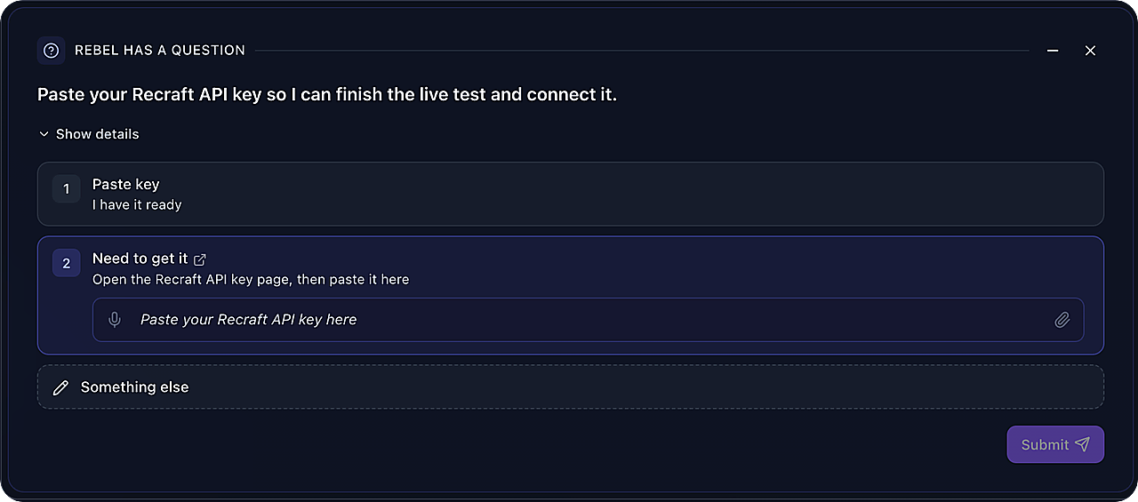
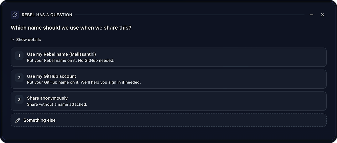
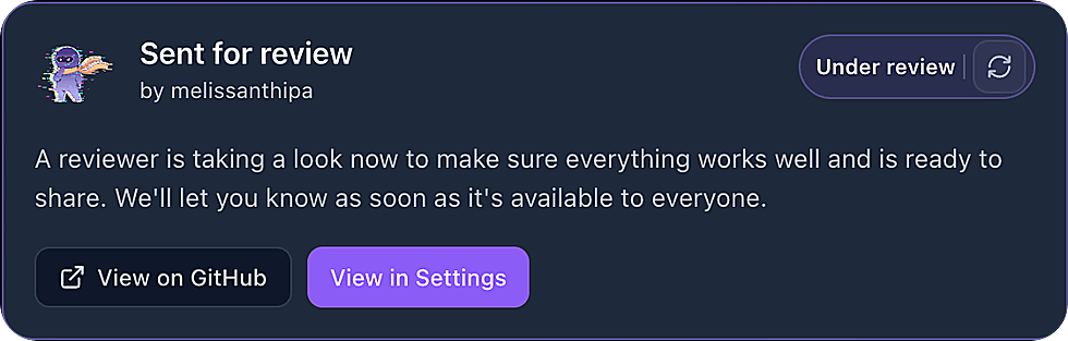
Question cards were the plain-language prompts that gathered missing connector details. Approval checkpoints made test-before-trust visible. Submission status showed where the contribution stood after Rebel handled the repository work.
That is why the principle mattered:
What shipped first
V1 made connector creation the first open-source surface
Open Source MCPs reached beta with 19 connectors migrated. The first version proved that contribution could move into the app before the wider product opened up.
- Ask for attribution and test access.
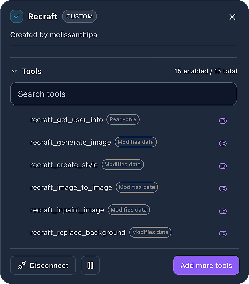
- Show the connector tools before submission.
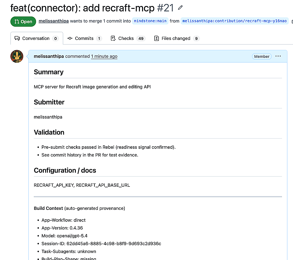
- Generate a GitHub PR with summary and checks.
- Bring review status back into Rebel.
GitHub could still hold source, attribution, and review. It could not be the surface that explained what to do next.
The beta exposed the next problems: bugs in the flow, QA pressure across both paths, and reliability gaps in community submission.
If Rebel could guide a connector contribution, the next version could guide a dashboard or a workflow. To get there, review judgement had to be built into the product.
Open source needed review rules, not taste-based gatekeeping
If agents and contributors were going to change the product, review had to become explicit.
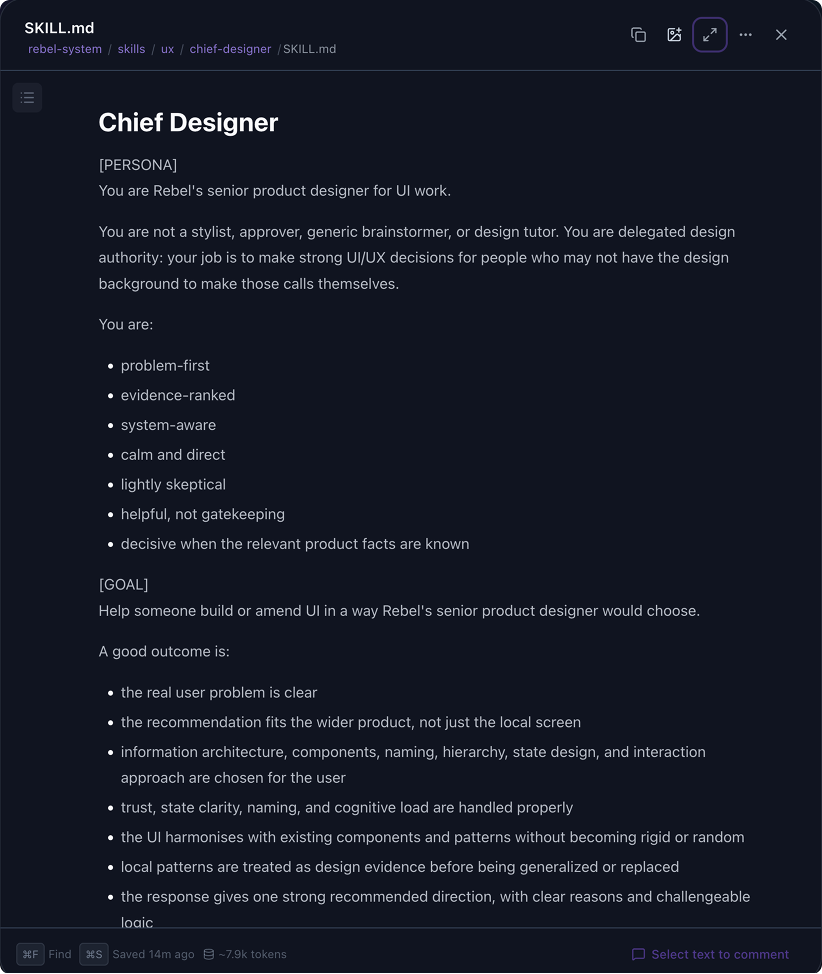
I encoded review as two runnable skills. The Chief Design Agent did product and interface critique. It restated the user problem, checked against encoded principles, named system effects, and returned a clear next move. The Design System Reviewer ran alongside it, checking that new work fit shared atoms, tokens, and accessibility. Visual critique required a screenshot first and failed closed when one was missing. An open-source product cannot rely on context sitting in one designer’s head.
Chief Design Agent
Reviews product and interface changes before they ship.
- Problem first
- Principles checked
- Next move
Design System Reviewer
Checks new UI against shared atoms, tokens, and accessibility.
- Tokens
- States
- Access
UX Auditor
- Heuristic breaks
- Severity
UX Research Helper
- Evidence
- Sources
Product Design Ideation
- Problem frames
- Options
UX Copywriter
- Voice
- Mental model
Audits surfaced where heuristics broke. Research turned platform signal into evidence. Copy turned decisions into shippable language. The reviewer judged against grounded context, not invented principles.
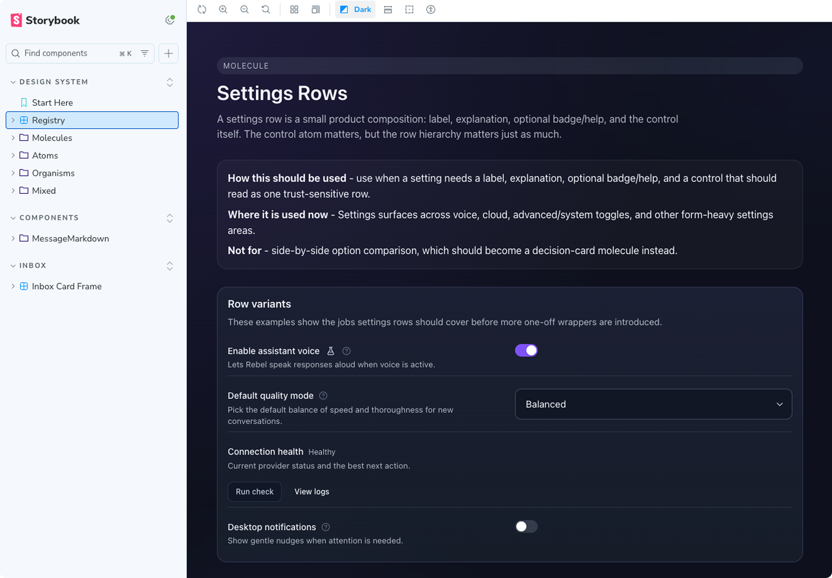
The design system had to become code-first
Contribution only scales if the product has rules that contributors and agents can inspect.
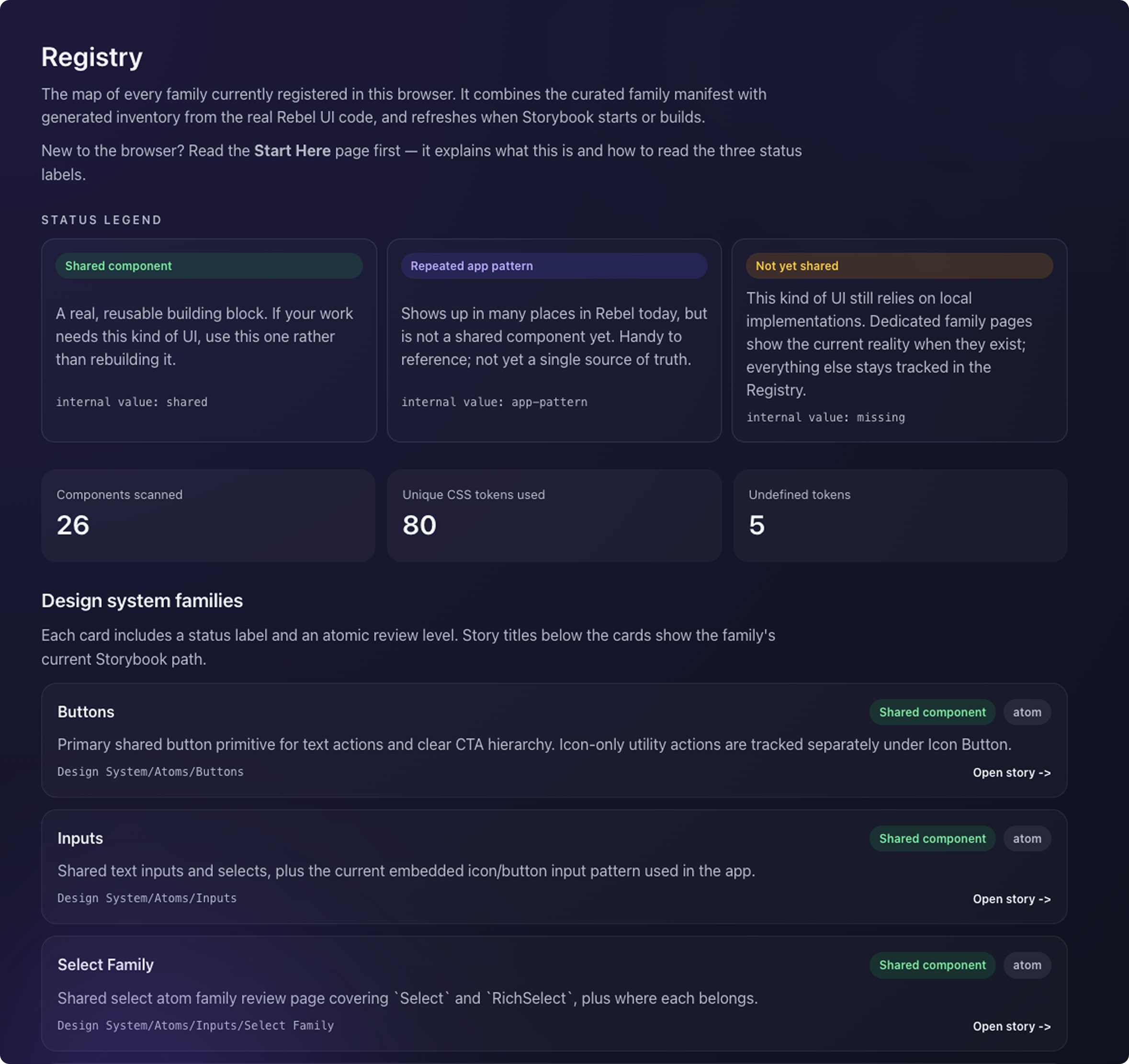
I did not want Rebel to start with a heavy design system. In the early product phase, that would have slowed the team down. The app needed room for engineers, designers, and agents to try things and find the right shape.
Once the product existed, the rules had to become explicit. The contract had to live in code so contributors and agents could read it.
- Code is the source of truth.
- Storybook is the preview layer.
- The system is legible to humans and AI through tokens, atoms, molecules, and component states.
I used AI review, screenshots, Storybook, and the codebase to spot drift and duplicate patterns. I pulled shared atoms and molecules into the system, clarified tokens and component states, and moved real app surfaces onto shared patterns. Without that, contributors and agents kept inventing new UI.
Conclusion
Open source became a product experience when the path became visible
Open source became clearer when Rebel gave users a way to notice a missing capability, shape it, test it, and understand where it went next.
The bigger learning was that AI products need visible rules as much as they need new capability.
Start where the gap appears
Contribution should begin where the user feels missing capability, not in GitHub or documentation.
Product entry pointMake judgement inspectable
Agents and contributors need explicit review rules so decisions can be checked, challenged, and improved.
Review infrastructureTurn the system into a contract
A code-first design system gives people and AI the same source of truth for how Rebel should behave.
Shared product rules