Mobile app for luxury brands: authenticity and storytelling
A B2C and B2B mobile app for luxury goods companies, enabling users to view the provenance of their luxury goods and transfer them digitally while ensuring their authenticity.
A B2C and B2B mobile app for luxury goods companies, that provided high-end products to both individual consumers and business clients. The app allowed users to view the provenance of their luxury goods and transfer them digitally while also ensuring their authenticity.
Through the app, users could view detailed information about the origin, history, and authenticity of their luxury goods, enabling them to make more informed purchasing decisions.
Problem
The team addressed a significant problem faced by luxury goods companies, the need to prove the authenticity of their products and provide extra value to customers by sharing their journeys. Luxury goods are often made of rare and high-quality materials that are difficult to source and authenticate. As a result, customers are increasingly concerned about the authenticity of luxury goods.
Our goal was to design an app that would allow users to easily view the provenance of their luxury goods, transfer them digitally, and check their authenticity. The app was also envisioned as a way to help luxury brands gain a deeper understanding of their products’ journeys, from the raw materials used to their final delivery to the customer. By providing a more secure and transparent way to manage luxury goods, the app helped add extra value and build trust with customers while addressing their concerns about the authenticity of luxury goods.
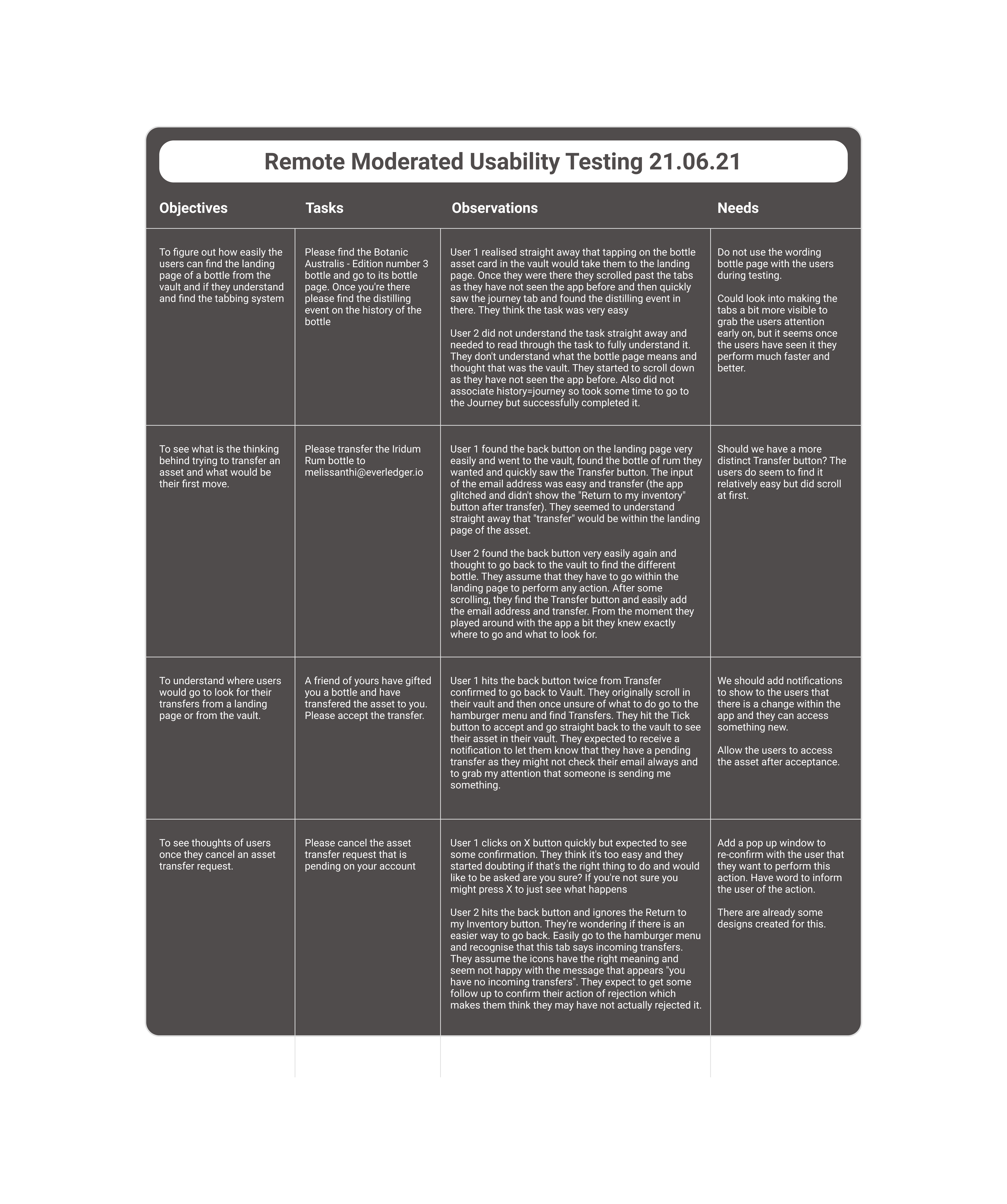
Usability insights for better design
When I joined the project, the designs had already been created and implemented by the development team, but they were in a rough format. I recognized that conducting usability testing was critical to uncovering any potential issues and identifying areas for improvement moving forward. To achieve this, I conducted remote moderated sessions via Zoom with a few users.
By observing how users interacted with the app, I was able to identify pain points and areas where the app could be improved and make a plan with the PO on how to proceed in the upcoming sprints.
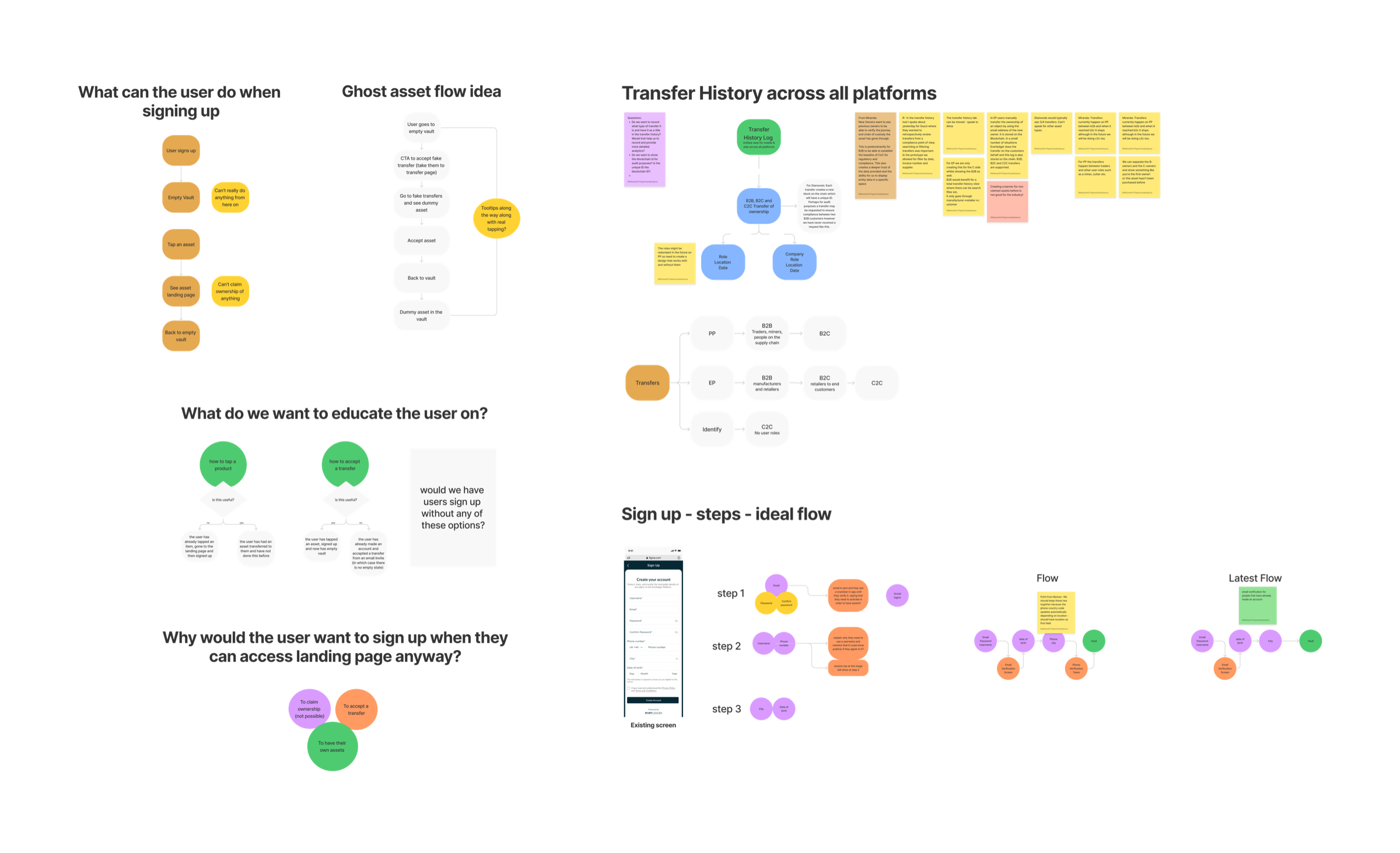
Refining user flows
After conducting moderated usability testing sessions, I identified several pain points in the app’s user experience, including issues with the sign-up process and transfer methods. To address these issues, I began working on new user flows that would improve the overall user experience of the app.
For the sign-up process, I simplified the steps required and reduced the amount of information the user needed to provide, resulting in a smoother and more efficient process. Additionally, I introduced a progress bar to help users understand where they were in the sign-up process and what steps were remaining.
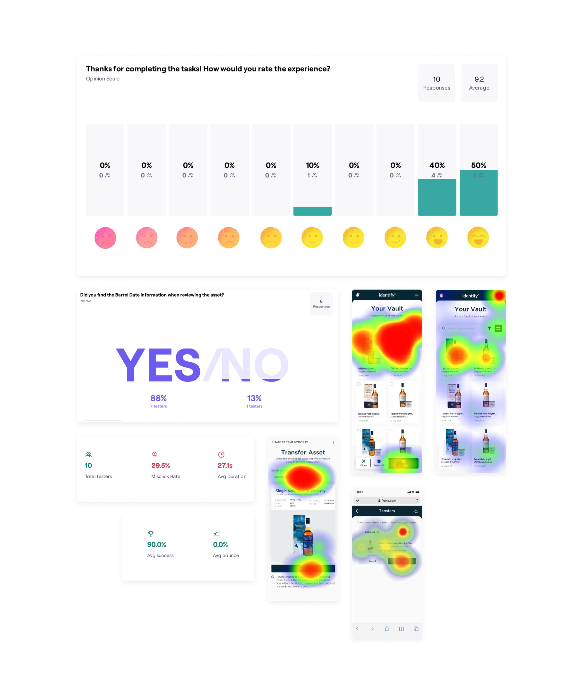
Validating ideas
With the new user flows in place, I wanted to validate my ideas and continue improving the user experience. To achieve this, I started creating mid-fidelity prototypes and testing them through various methods such as A/B testing using Maze.
Through these tests, I was able to gather data on user behavior and make informed decisions on what changes needed to be made to the app. I also made sure to incorporate user feedback into the design process, ensuring that the final product was tailored to the needs and preferences of our target audience.
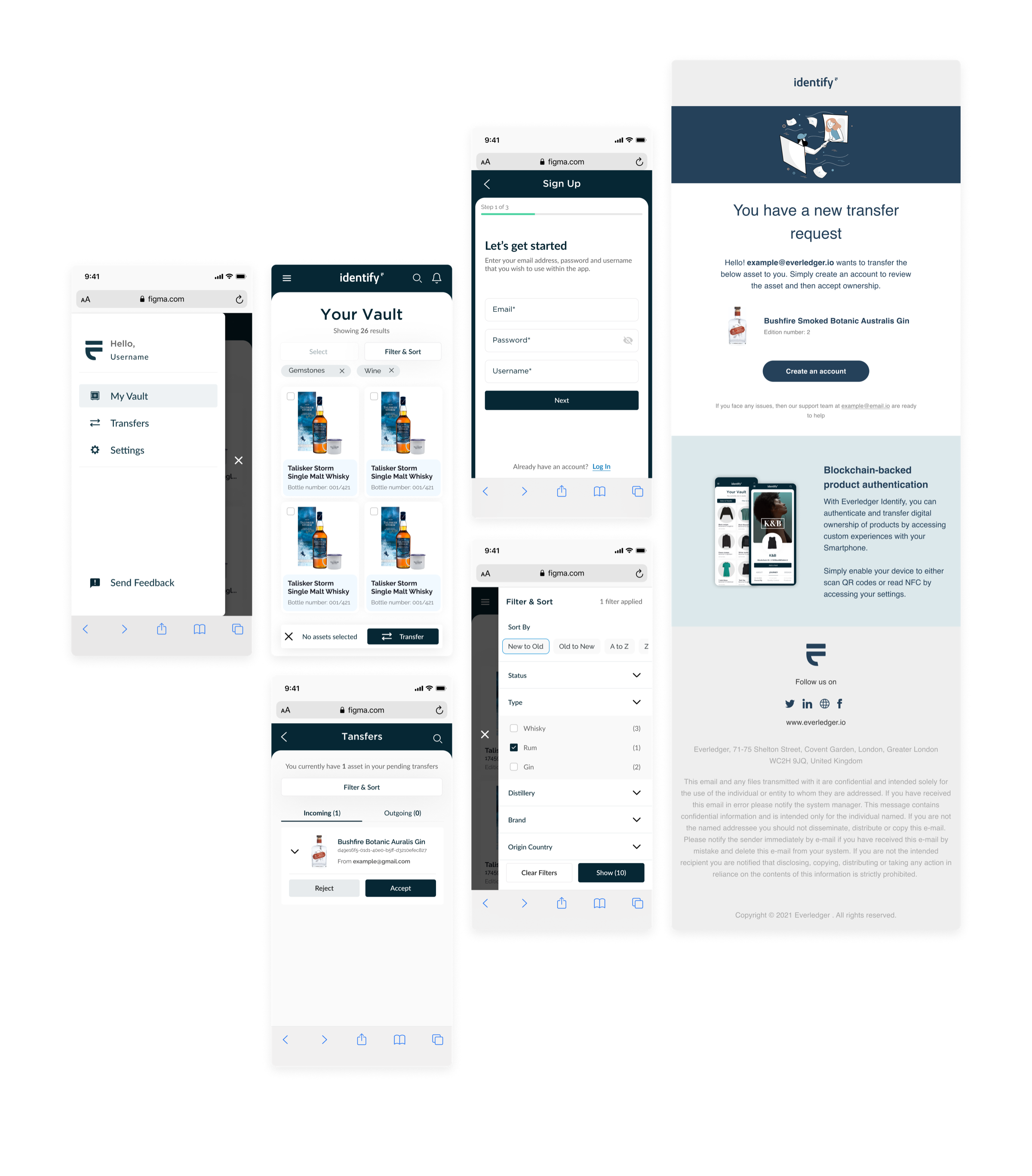
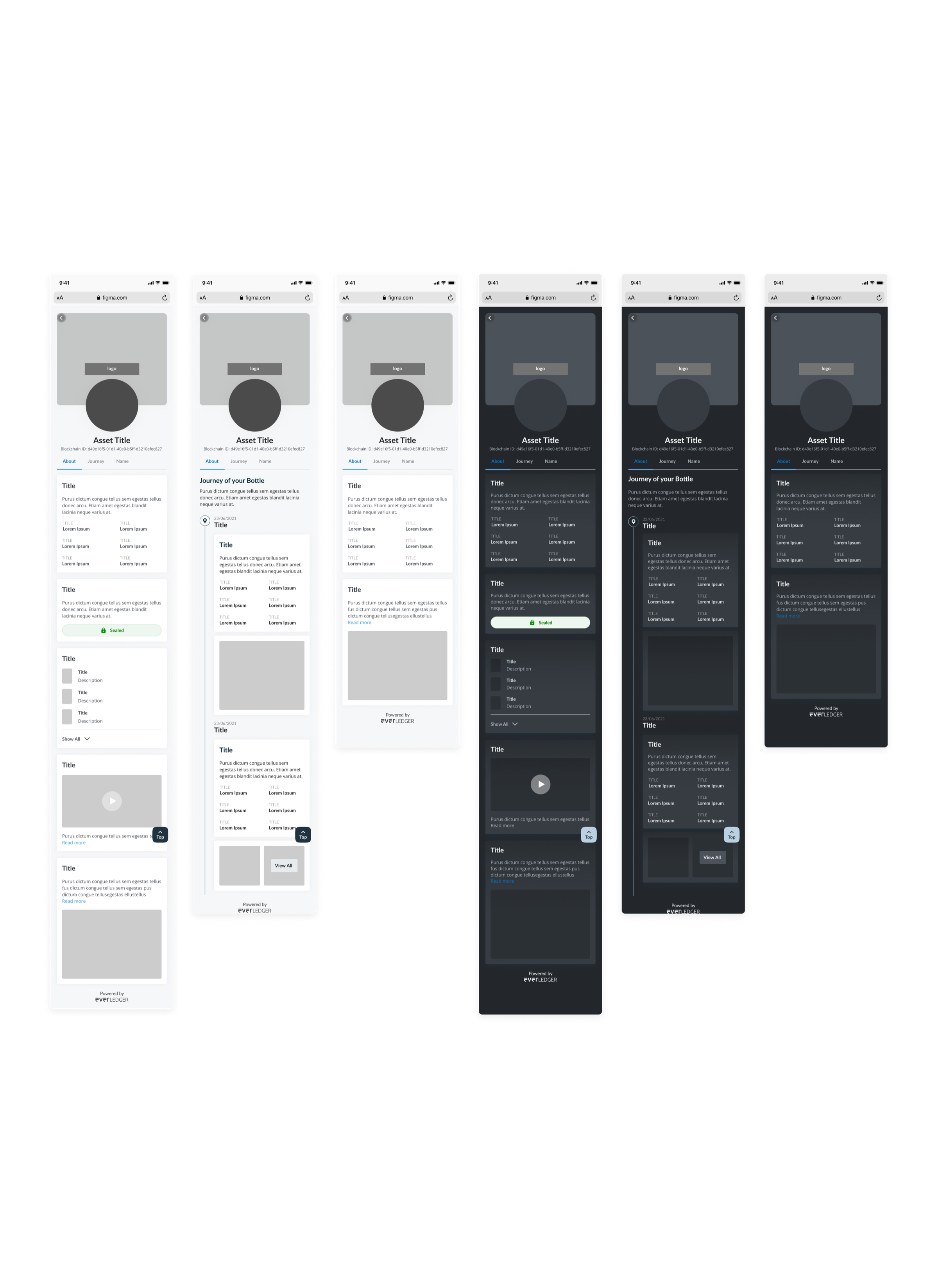
Updated screens
After analysing my findings from testing the prototypes, I was able to identify what worked and what didn’t in the app’s user experience. With this knowledge, I moved on to creating high-fidelity designs and detailed specifications for the developers.
My focus was on key areas such as sign-up, vault, search and filter. Additionally, I used Figma plugins to create emails that produced code, streamlining the process for the developers and ensuring a seamless experience for the end-users.
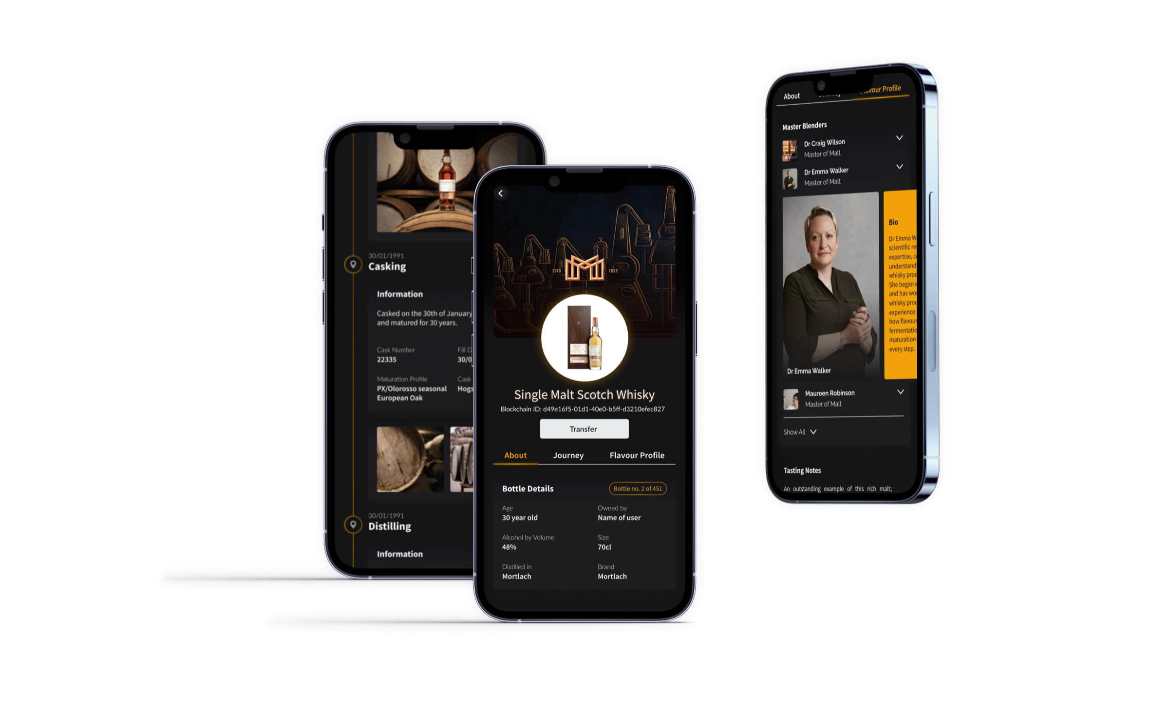
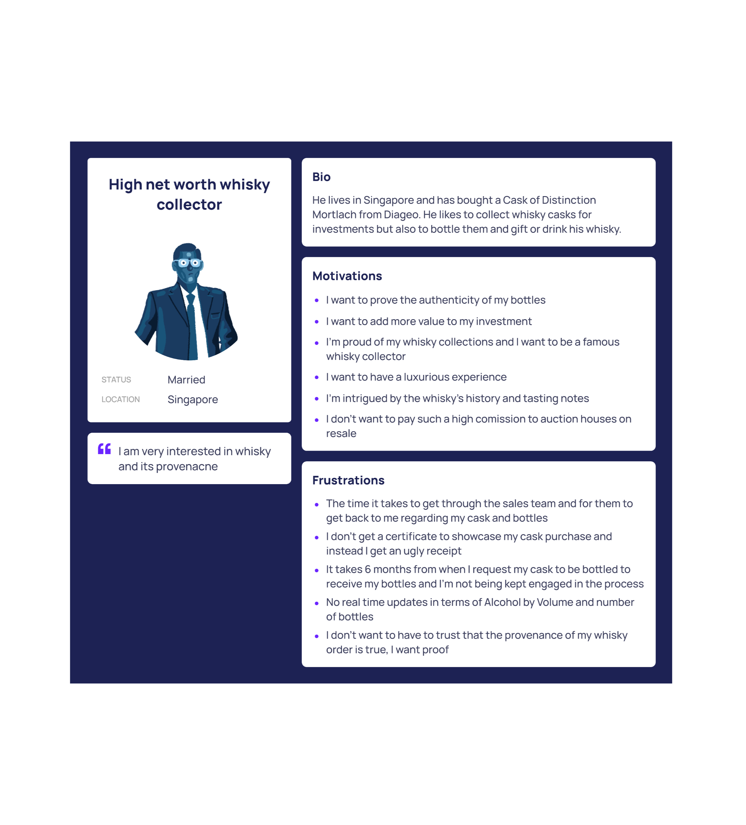
Catering to a new client
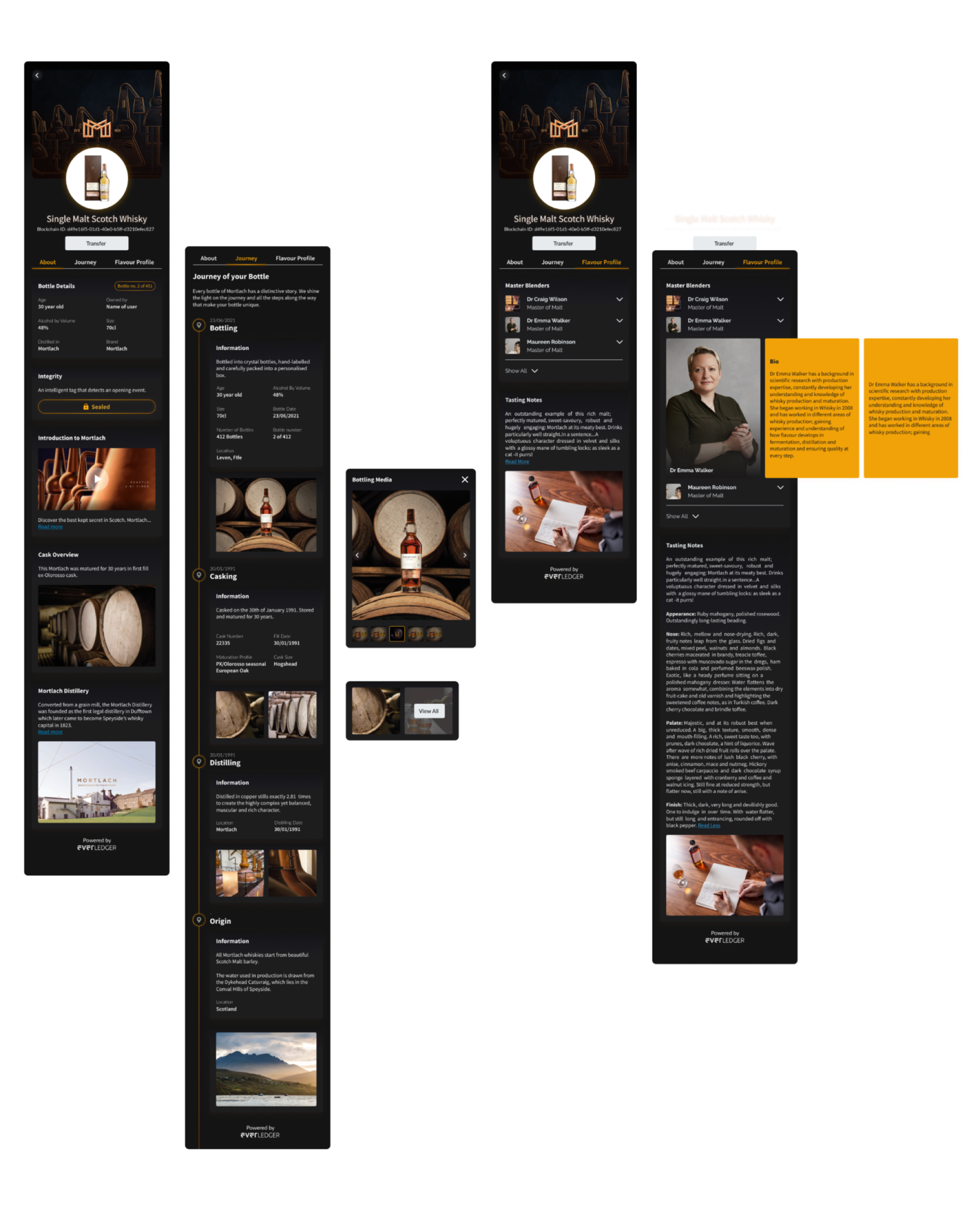
We were fortunate enough to secure a new luxury brand client who wished to use our app to prove a concept involving expensive casks of whisky for collectors. Our app would not only show the authenticity of their products but also track the bottles created from each cask.
To kick off the project, we first conducted interviews with both the users of the app and our new clients. This allowed us to understand the needs and desires of our users and draw out an ideal user journey. My role in this process was to facilitate the interviews and create the user journey, ensuring that the app would meet the needs of our users and exceed the expectations of our clients.
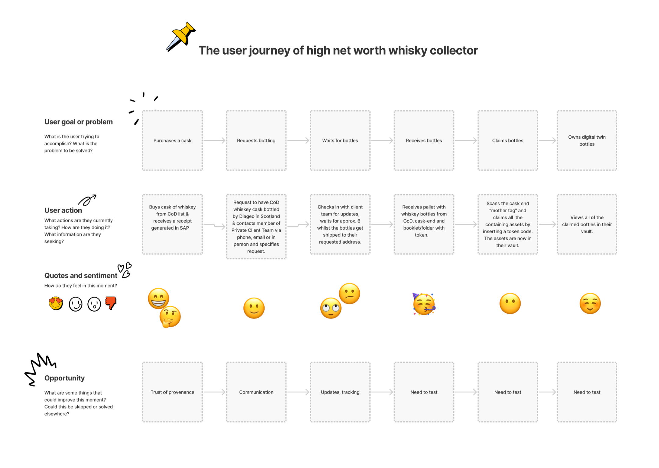
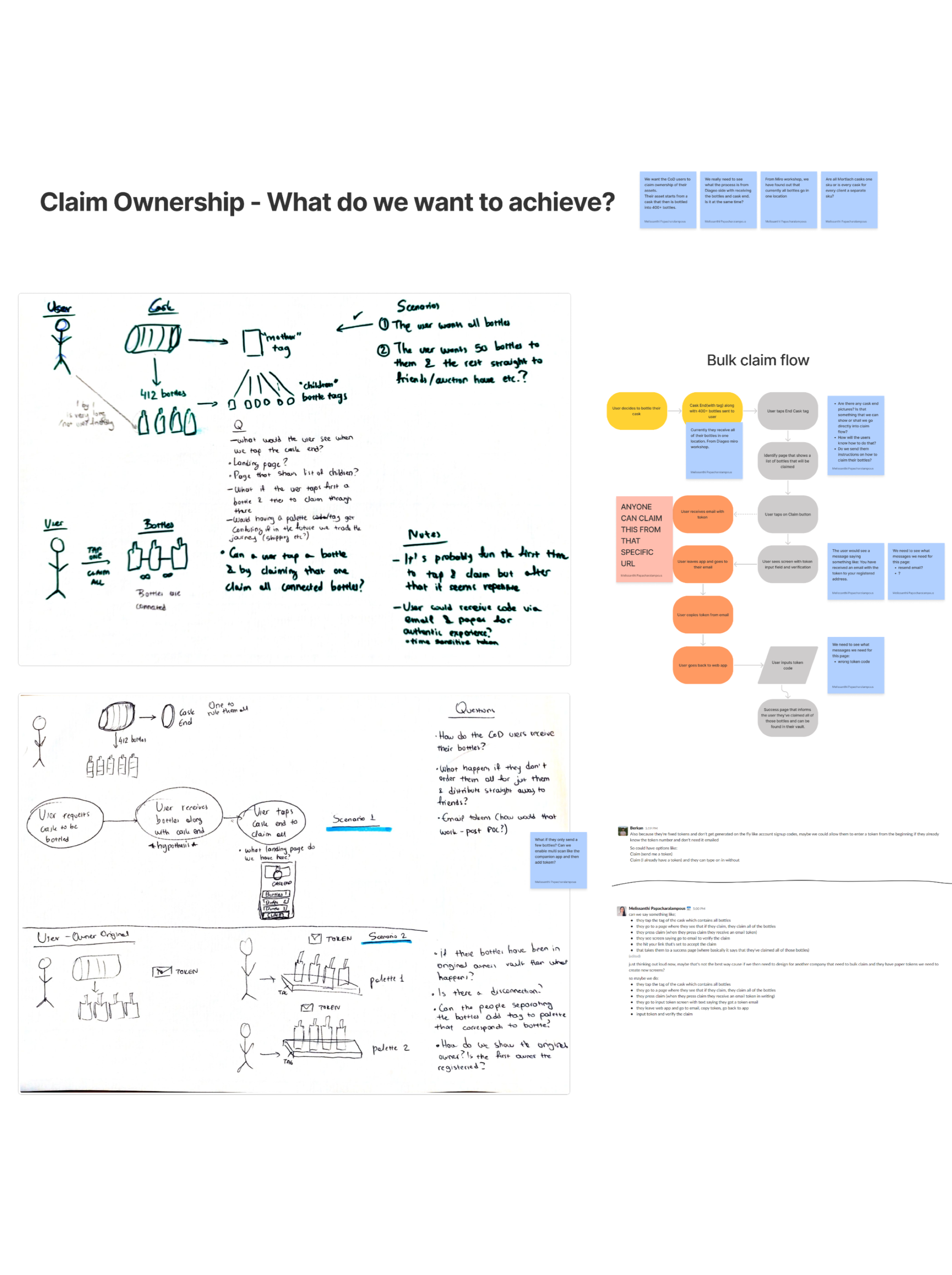
Bridging UX and back-end development
As we delved deeper into the project, we encountered a unique challenge: to enable users to tap on their physical asset and create hundreds of digital ones instantly. This required us to bridge the gap between the physical and digital worlds, which presented a series of technical hurdles.
To overcome these obstacles, we collaborated closely with the back-end developer, sketching out ideas and user flows and ensuring that all design elements could be executed on the back-end flawlessly. This process was challenging, but it enabled us to create a seamless and efficient user experience that fulfilled our users’ needs and expectations.
High-fidelity designs
With a deep understanding of the brand and its products, I set out to create high-fidelity designs. Drawing inspiration from the whisky brand’s unique style, I worked on incorporating design elements that would capture its essence and appeal to its target audience.
By reusing existing design components that we had previously created for other clients, I was able to save time and make minimal changes to create a cohesive design for the app. The client was thrilled with the end result, and we were able to create a visually engaging experience that captured the essence of their product.
Streamlining the process
After completing the final designs, it became clear that creating new designs from scratch for every client was inefficient. To optimize our process, I collaborated with the product team to develop themed templates based on client preferences, with necessary details collected in Excel documents for each block.
As our customer base grew, I also implemented a feedback button on our navigation menu, linking to an external app that analyzed and sent us feedback as bugs or suggestions. To further improve the user experience, I set up surveys to gather insights from existing users. This approach helped us stay ahead of any issues or concerns, allowing us to provide faster and more efficient services to our clients while continuing to improve our platform.
Conclusion
This project was a great learning experience for me and the team. Despite the challenges we faced in bridging the physical and digital worlds, we successfully created a user-friendly and efficient mobile app for our client’s whisky collection. Our proof of concept with the client was successful, and we were able to incorporate their feedback into the final designs.
Throughout the project, we utilized various UX design methodologies such as user research, prototyping, and testing, which allowed us to make informed decisions and create a seamless user experience. We also implemented new strategies, such as creating themed templates and gathering user feedback, to streamline the design process and improve the platform’s functionality.