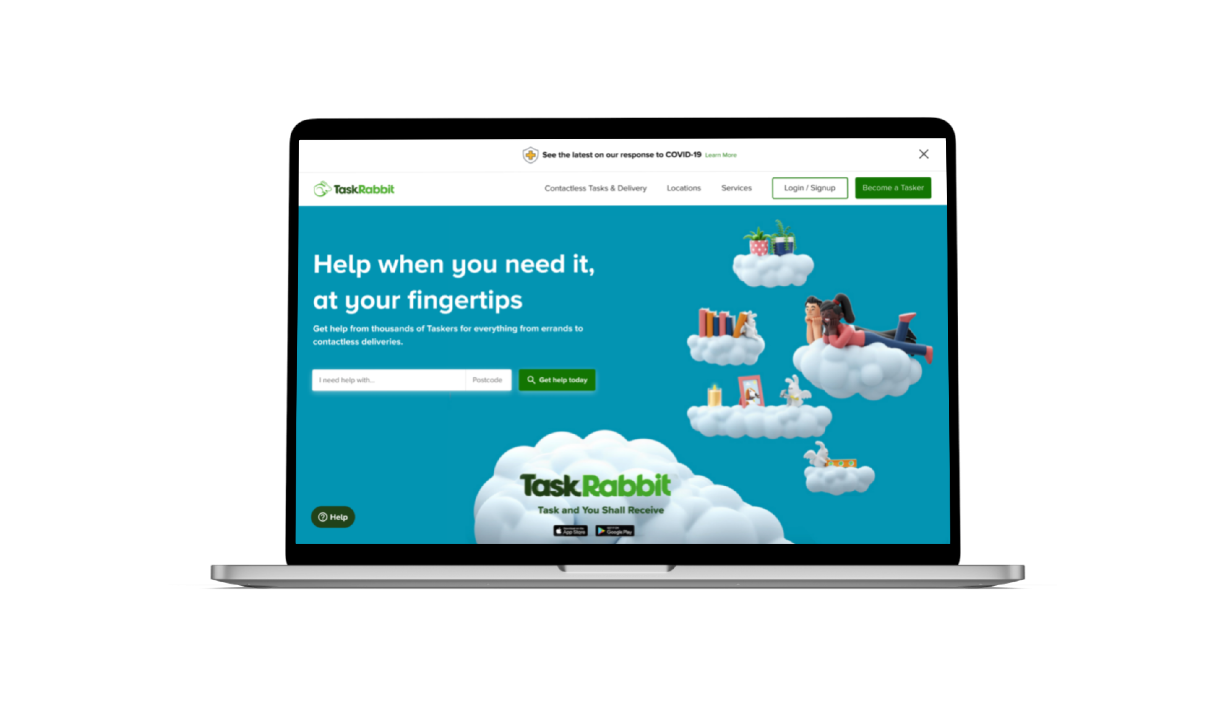
TaskRabbit: a personal website redesign
A self-initiated redesign of TaskRabbit's booking flow, focused on rethinking trust, comparison, and communication before booking, for users tackling complex tasks.
TaskRabbit is an online platform that provides services to local consumers by matching them with freelance labour to complete errands and tasks including cleaning, moving, handyman work, etc. as quickly as on the same day. Through their website, users search for the type of job they need to get done, input some details, and then choose from a variety of freelancers.
Problem
The platform provides quite a straightforward approach for non-complex tasks such as cleaning, where the users can see results quickly without having to register, and then book a Tasker upon signing up. However, what if the users need help with a more complicated project? Could we expect that the users will not always know what their exact needs are for a task, and therefore will need guidance from a Tasker before they book a gig? Moreover, they want to feel like their money and time will go to a trustworthy person that will get the job done well.
Going through these processes present a few issues for the users:
- Booking any task requires early (prior to communication) credit card input which lessens user trust
- Social proof is shown only through text
- Determining hours needed for complex tasks is not possible before booking
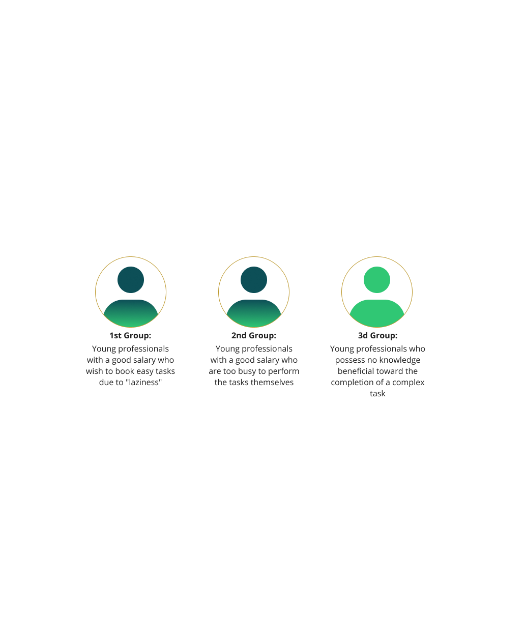
Users & analysis
Since this is a case study, I had no access to TaskRabbit’s analytics, and I conducted my research through open online resources. Looking into TaskRabbit’s blogs, competitor’s target markets and reviews online, I discovered the following:
- In 2014, TaskRabbit specified their main target audience as busy working women and mothers
- In 2017, Ikea Group bought TaskRabbit and started promoting furniture assembly Taskers through their platform
- Ikea’s Group target audience is Millennials
- Online reviews indicate that young families and couples also use the service.
In my opinion, there are three main types of users for the platform and the user group that I will be focusing on is the third. The reason is that the third group has the biggest need for changes on the website, whilst the other two groups will also benefit from smaller changes.
Online user surveys
To gather insights from potential users, I conducted an online survey targeted at 15 young professionals aged 25-35, who were asked to review TaskRabbit. The results of the survey were eye-opening:
- Participants felt that the appearance of the website looked dated
- Users found it difficult to communicate with Taskers directly before booking, leading to feelings of insecurity
- Users felt frustrated with having to fill out too many questions before receiving a price quote
- The requirement of a credit card during the booking process caused many users to drop off
- There were concerns about the trustworthiness of Taskers, with several participants reporting past experiences with fraud
- The majority of users (14 out of 15) preferred to compare Taskers before booking, rather than quickly booking the first one they see
- Similarly, 13 out of 15 users wished to see multiple results rather than one Tasker at a time
- Finally, 12 out of 15 users felt that communicating with a Tasker before booking would improve their confidence in the service
Interviews & testing
I conducted usability testing on the existing website and user interviews with 5 users. Here are the problematic areas I identified:
- The homepage hero image conveys a strong love story connotation, which can be confusing for users
- Users become frustrated during the sign-up process because they don’t see the social sign-up option until after inputting their details
- The “Describe your task” page feels like a lengthy process to most users
- Users ignore the time and date filters on the Taskers page, resulting in a suboptimal experience
- Users drop off at the payment page, causing a significant loss of potential business
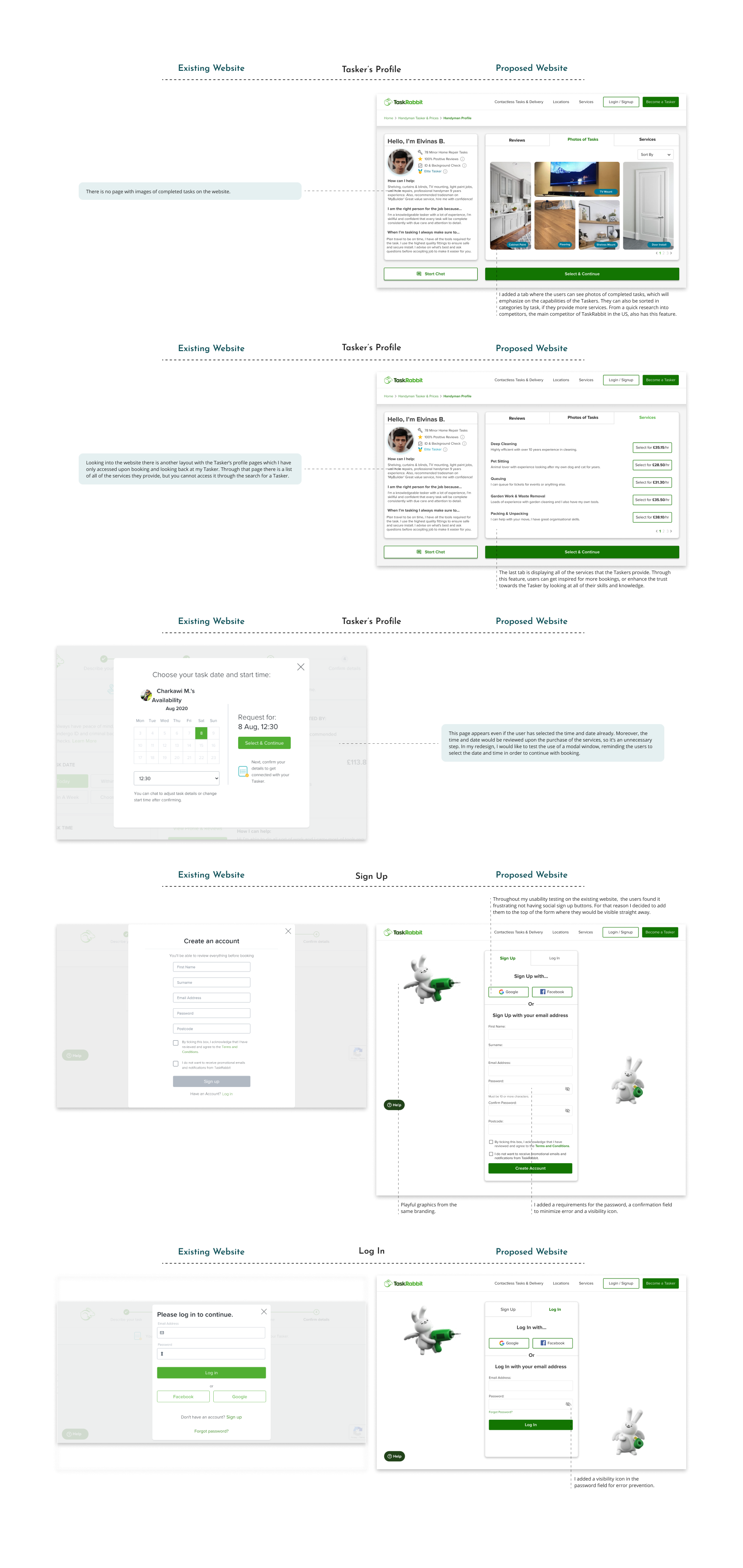
- Users don’t perceive the Taskers as trustworthy; the background check tab on Tasker profiles goes unnoticed
- Users find it annoying to have to repeat the whole process if they want to change tasks or locations.
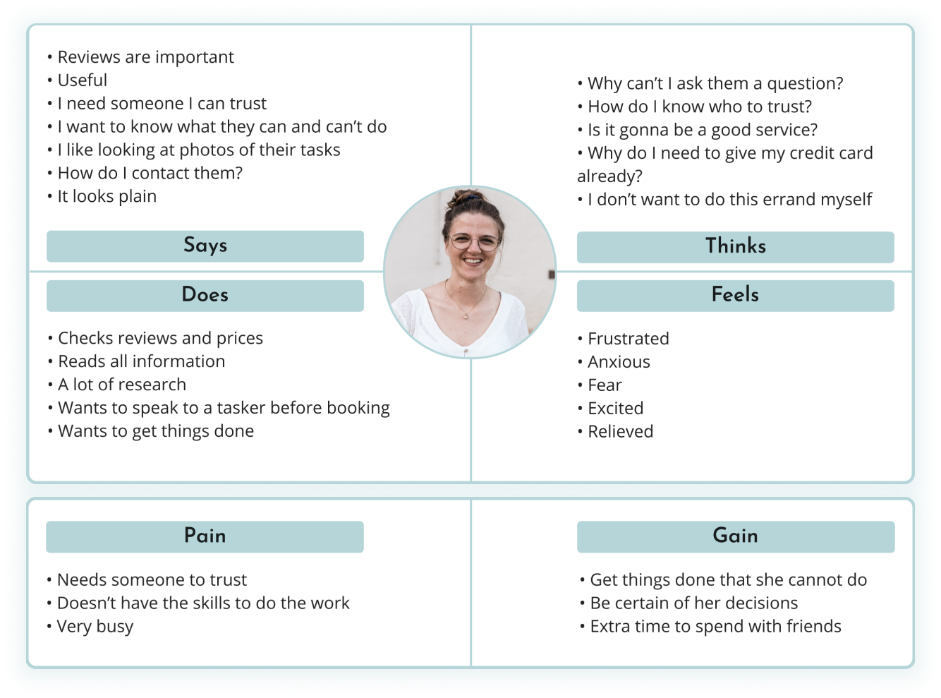
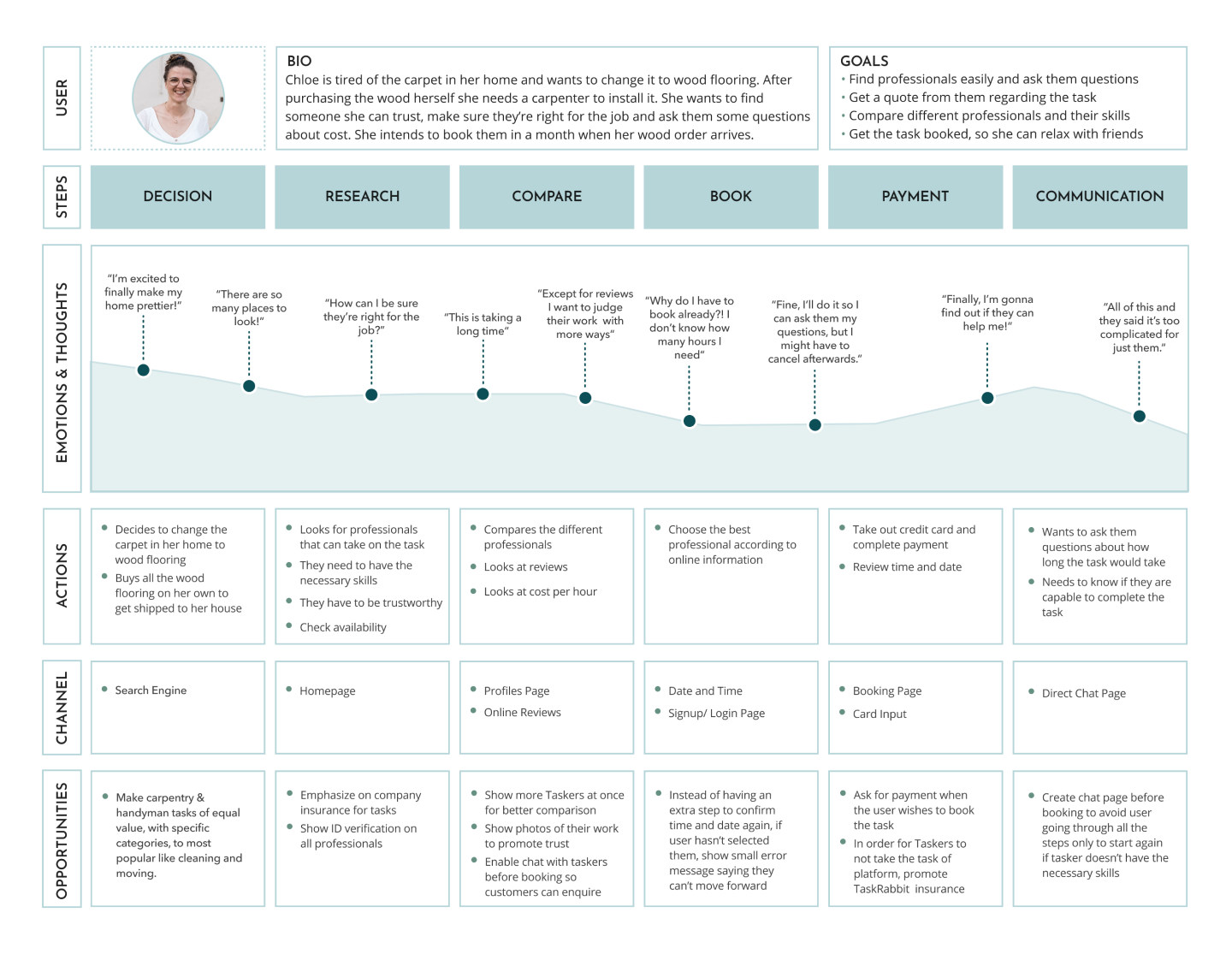
Empathy map
To kick off the Define stage, I focused on synthesizing my observations in order to gain a deeper understanding of the opportunities and challenges that users face.
By analyzing and distilling my findings, I was able to uncover valuable insights that informed the direction of the project and helped me to identify potential solutions.
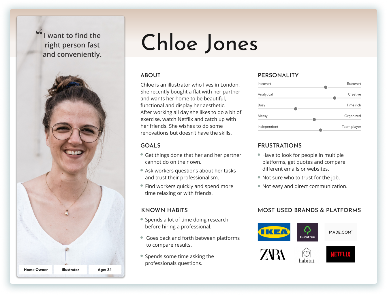
User persona
To better cater to the needs of young professionals who lack expertise in complex tasks and require guidance or validation from Taskers before booking a gig, I developed a persona that specifically targets this demographic.
By understanding their pain points and challenges, I was able to create a more empathetic design that speaks to their unique requirements. This persona was a key factor in informing the design decisions for the project and ensured that the final solution met the needs of our target audience.
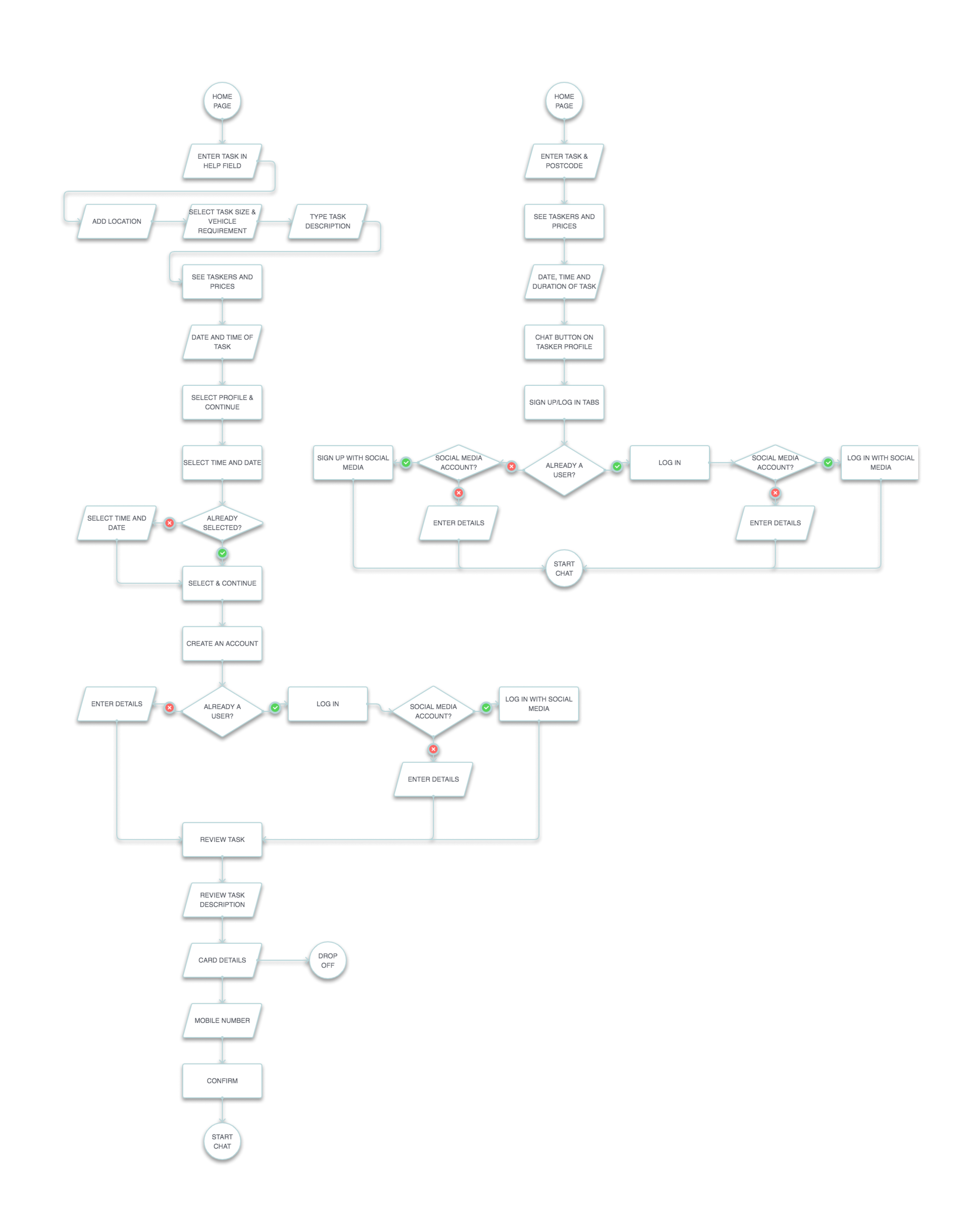
User journey & optimised flows
To improve the user experience, I analyzed the existing journey of my persona to communicate with a Tasker and book a gig.
Based on my findings, I created both an existing and proposed user flow that outlines the steps and actions required for the user to start communicating with a Tasker. In the proposed user flow, I streamlined the process to reduce the number of steps required, preventing users from losing interest in the services and becoming demotivated by early requirements.
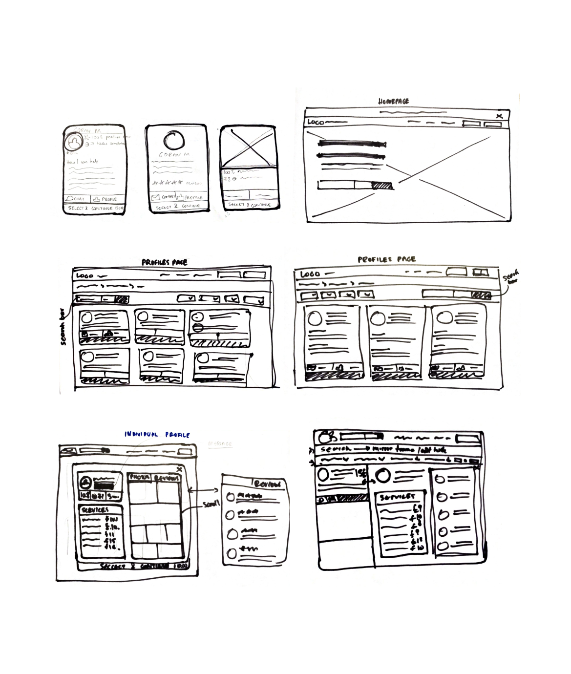
Sketching
During the Ideate stage, I began sketching various versions of the pages that required redesigning. My main focus was on showcasing a broader range of profiles to users, allowing them to compare and contrast with ease.
I aimed to strike a balance between providing enough information to make informed decisions without overwhelming users with too many buttons or excessive amounts of data. Through numerous iterations, I was able to create designs that were both visually appealing and user-friendly.
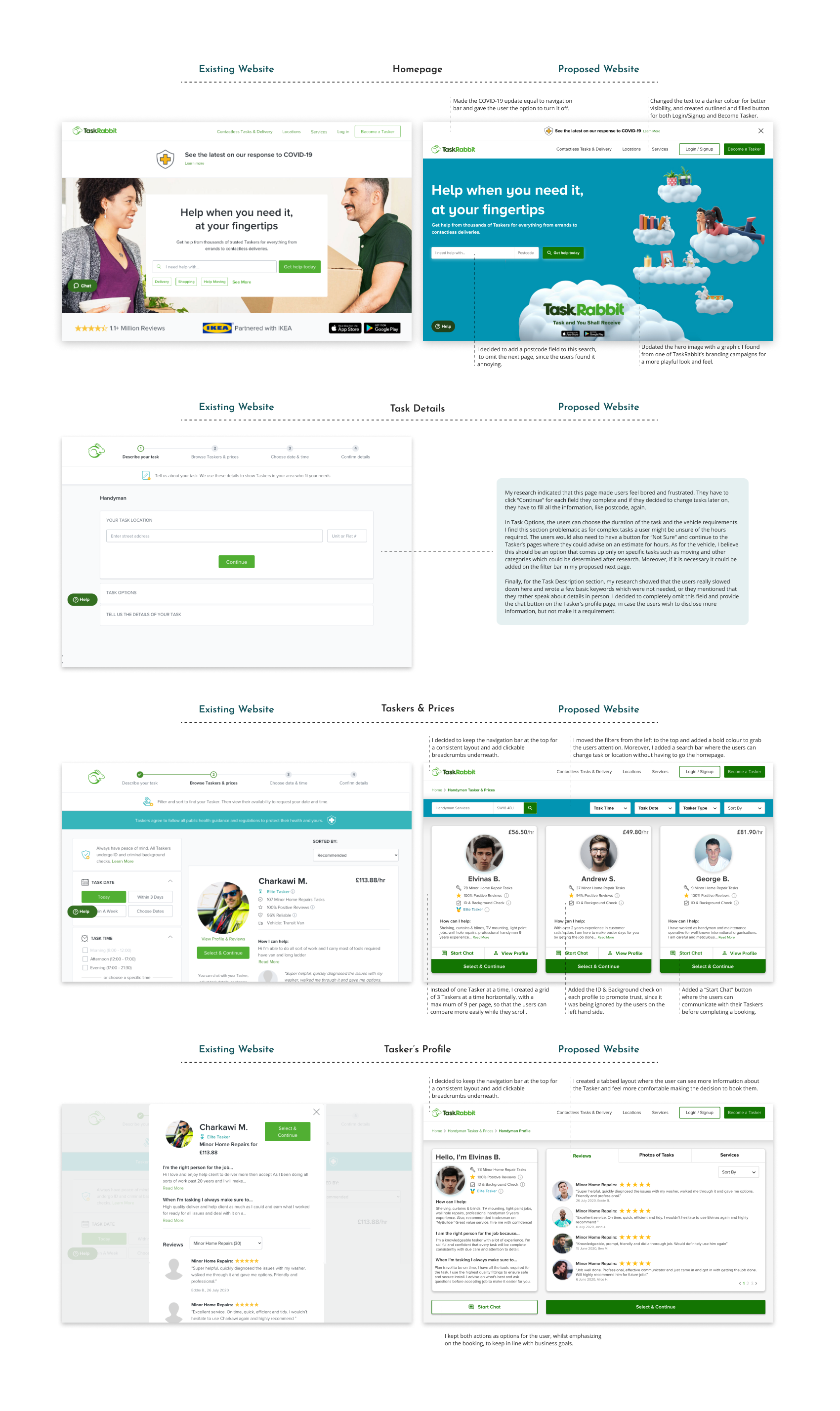
High-fidelity designs
These are the final pages I designed for the TaskRabbit redesign. I made several changes to improve the user experience, and I’ve annotated them to explain why. To maintain consistency with TaskRabbit’s branding, I used a green color for buttons and links and added some graphics from their branding campaigns to enhance the visual appeal.
Conclusion
Throughout my first UX/UI case study, I encountered several challenges and learned important lessons. For example, I discovered that some of my survey questions were biased and removed them from my results. While I focused on the third group of users who could benefit from my proposed changes, I recognized the need to gather more data and analyze the percentage of these users in comparison to the other two groups.
One possible reason why TaskRabbit doesn’t allow for direct communication between users and Taskers could be the platform’s payment model, which takes a percentage of each task completed. However, I believe that emphasizing TaskRabbit’s insurance and chat monitoring could address these concerns and build trust with users.
Moving forward, I would like to access TaskRabbit’s analytics and gain a deeper understanding of the user experience. I plan to gather more evidence on pages that connect to my redesign and evaluate how they impact the user flow. This case study has sparked my passion for continuous learning and development, and I look forward to collaborating with other disciplines in future UX/UI projects.